
 | This page, part of the
Graphics Lab Wikiproject, is an
archive of requests for 2018. Please do not edit the contents of this page. You can submit new requests here. |

L'égyptienne - poster
{{ resolved}}
-
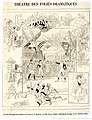 Theatre poster from 1890
.jpeg)
- Article(s)
- L'égyptienne (Lecocq)
- Request
Would it be possible, please, to clean up the image, particularly the (sticky tape?) marks all round the edge? Any clarification of the rather dim image would also be most welcome. Tim riley talk 08:57, 31 October 2018 (UTC)
- Graphist opinion(s)
![]() Done
PawełMM (
talk)
09:59, 31 October 2018 (UTC)
Done
PawełMM (
talk)
09:59, 31 October 2018 (UTC)
- Gosh! That was quick. Thank you so much! Tim riley talk 10:06, 31 October 2018 (UTC)
myrrh Boilerplate do not create a new image as it is not needed.
{{ resolved}}

- Article(s)
- myrrh
- Request
- please trim excess blank space to focus on object… Boilerplate do not create a new image as it is not needed.-- Kintetsubuffalo ( talk) 17:03, 30 October 2018 (UTC)
- Graphist opinion(s)
![]() Done
PawełMM (
talk)
17:15, 30 October 2018 (UTC)
Done
PawełMM (
talk)
17:15, 30 October 2018 (UTC)
- Thank you!-- Kintetsubuffalo ( talk) 21:13, 1 November 2018 (UTC)
Crystal Lake, Illinois
{{ resolved}}
- Article(s)
- Crystal Lake, Illinois
- Request
- please trim to disk… -- Kintetsubuffalo ( talk) 21:13, 1 November 2018 (UTC)
- Graphist opinion(s)
![]() Done
PawełMM (
talk)
21:58, 1 November 2018 (UTC)
Done
PawełMM (
talk)
21:58, 1 November 2018 (UTC)
- Thank you!-- Kintetsubuffalo ( talk) 17:34, 2 November 2018 (UTC)
With a Little Help From My Friends
{{ resolved}}

- Article(s)
- With a Little Help From My Friends
- Request
- please rotate slightly to straight… -- Kintetsubuffalo ( talk) 21:06, 2 November 2018 (UTC)
- Graphist opinion(s)
![]() Done
PawełMM (
talk)
21:36, 2 November 2018 (UTC)
Done
PawełMM (
talk)
21:36, 2 November 2018 (UTC)
- Thank you!-- Kintetsubuffalo ( talk) 00:27, 3 November 2018 (UTC)
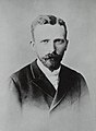
Olav Aukrust Boilerplate do not create a new image as it is not needed.
{{ resolved}}

- Article(s)
- Olav Aukrust
- Request
- please trim excess space at top… Boilerplate do not create a new image as it is not needed.-- Kintetsubuffalo ( talk) 00:26, 3 November 2018 (UTC)
- Graphist opinion(s)
![]() Done
PawełMM (
talk)
05:50, 3 November 2018 (UTC)
Done
PawełMM (
talk)
05:50, 3 November 2018 (UTC)
- Thank you!-- Kintetsubuffalo ( talk) 06:18, 4 November 2018 (UTC)
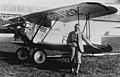
Office of Defense Cooperation
{{ resolved}}
- Article(s)
- Office of Defense Cooperation
- Request
- please trim to disk… -- Kintetsubuffalo ( talk) 00:34, 3 November 2018 (UTC)
- Graphist opinion(s)
![]() Done
PawełMM (
talk)
05:55, 3 November 2018 (UTC)
Done
PawełMM (
talk)
05:55, 3 November 2018 (UTC)
- Thank you!-- Kintetsubuffalo ( talk) 06:19, 4 November 2018 (UTC)
Olympe de Gouges
{{ resolved}}

- Article(s)
- Olympe de Gouges
- Request
- please fade out or remove side-striping, which hides part of the painting and was clearly added later… -- Kintetsubuffalo ( talk) 00:52, 3 November 2018 (UTC)
- Graphist opinion(s)
![]() Done
PawełMM (
talk)
06:18, 4 November 2018 (UTC)
Done
PawełMM (
talk)
06:18, 4 November 2018 (UTC)
- Thank you!-- Kintetsubuffalo ( talk) 06:19, 4 November 2018 (UTC)
Mario Segale
{{ resolved}}
- Article(s)
- Mario Segale
- Request
- please remove border… -- Kintetsubuffalo ( talk) 00:56, 3 November 2018 (UTC)
- Graphist opinion(s)
![]() Done
PawełMM (
talk)
06:41, 3 November 2018 (UTC)
Done
PawełMM (
talk)
06:41, 3 November 2018 (UTC)
- Thank you!-- Kintetsubuffalo ( talk) 06:19, 4 November 2018 (UTC)
Claudius
{{ resolved}}

- Article(s)
- Claudius
- Request
- please trim to object… -- Kintetsubuffalo ( talk) 06:19, 3 November 2018 (UTC)
- Graphist opinion(s)
![]() Done
PawełMM (
talk)
06:52, 3 November 2018 (UTC)
Done
PawełMM (
talk)
06:52, 3 November 2018 (UTC)
- Thank you!-- Kintetsubuffalo ( talk) 06:20, 4 November 2018 (UTC)
Dorsey Crowe
{{ resolved}}

- Article(s)
- Dorsey Crowe
- Request
- please trim to photo… -- Kintetsubuffalo ( talk) 02:11, 5 November 2018 (UTC)
- Graphist opinion(s)
![]() Done
PawełMM (
talk)
05:56, 5 November 2018 (UTC)
Done
PawełMM (
talk)
05:56, 5 November 2018 (UTC)
- Thank you!-- Kintetsubuffalo ( talk) 19:47, 5 November 2018 (UTC)
Removing retailer's watermark
-
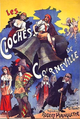 1877 theatre poster

- Article(s)
- Les cloches de Corneville
- Request
- You have kindly removed vendors' watermarks from images before, and I'd be very grateful if you could do the same for this one: the watermark runs vertically down the right-hand side. Tim riley talk 22:52, 5 November 2018 (UTC)
- Graphist opinion(s)
![]() Done
PawełMM (
talk)
06:24, 6 November 2018 (UTC)
{{
resolved}}
Done
PawełMM (
talk)
06:24, 6 November 2018 (UTC)
{{
resolved}}
- That's excellent. Thank you so much! Tim riley talk 08:11, 6 November 2018 (UTC)
Aires Ali
{{ resolved}}
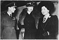
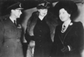
-
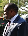
 Aires Ali (right)
 -
-


- Article(s)
- Aires Ali, etc
- Request
- Please create a crop image of Aires Ali out of this pic. I tried to do that myself by using the crop tool, but for some reason I was unable to do so (the notification mentioned some html problem with original pic). Maybe someone more experienced would be able to grasp what the problem is. -- Sundostund ( talk) 02:00, 2 November 2018 (UTC)
- Graphist opinion(s)
![]() Done
PawełMM (
talk)
05:24, 2 November 2018 (UTC)
Done
PawełMM (
talk)
05:24, 2 November 2018 (UTC)
- @ PawełMM: Great work! Thanks a lot! -- Sundostund ( talk) 19:06, 7 November 2018 (UTC)
John Williams Gunnison Boilerplate do not create a new image as it is not needed.
{{ resolved}}

- Article(s)
- John Williams Gunnison
- Request
- please trim to image and straighten… Boilerplate do not create a new image as it is not needed.-- Kintetsubuffalo ( talk) 08:13, 7 November 2018 (UTC)
- Graphist opinion(s)
![]() Done
PawełMM (
talk)
09:20, 7 November 2018 (UTC)
Done
PawełMM (
talk)
09:20, 7 November 2018 (UTC)
- Thank you! Kintetsubuffalo ( talk) 09:33, 7 November 2018 (UTC)
Mayflower Council
{{ resolved}}
.jpg)
- Article(s)
- Mayflower Council
- Request
- please create locally-hosted (not Commons) png version, without the background, color corrected, named File:Mayflower Council CSP… -- Kintetsubuffalo ( talk) 08:29, 16 October 2018 (UTC)
- Graphist opinion(s)
![]() Done
PawełMM (
talk)
09:23, 16 October 2018 (UTC)
Done
PawełMM (
talk)
09:23, 16 October 2018 (UTC)
- Thank you
PawełMM, can you make it a png as requested?--
Kintetsubuffalo (
talk)
17:17, 16 October 2018 (UTC)
- @
Kintetsubuffalo: According to the
terms of use, there can be only one loaded file. I do not know if and how the next copy could be loaded. The graphics are displayed correctly in the infobox. Why do you want to create another copy?
PawełMM (
talk)
06:34, 17 October 2018 (UTC)
- Because that png was my original request that I asked for. I have already fixed the jpg file name which was also not what I requested. Please follow the whole request if you're going to do these. I very much appreciate your work, when you follow the request-- Kintetsubuffalo ( talk) 09:00, 17 October 2018 (UTC)
- @
Kintetsubuffalo: According to the
terms of use, there can be only one loaded file. I do not know if and how the next copy could be loaded. The graphics are displayed correctly in the infobox. Why do you want to create another copy?
PawełMM (
talk)
06:34, 17 October 2018 (UTC)
Kylix
{{ resolved}}

- Article(s)
- Kylix
- Request
- please remove excess dead space… -- Kintetsubuffalo ( talk) 02:30, 8 November 2018 (UTC)
- Graphist opinion(s)
![]() Done
PawełMM (
talk)
04:52, 8 November 2018 (UTC)
Done
PawełMM (
talk)
04:52, 8 November 2018 (UTC)
- Thank you! Kintetsubuffalo ( talk) 05:08, 8 November 2018 (UTC)
Tongan paʻanga
{{ resolved}}

_Entada_phaseoloides_deux_graines.jpg)
- Article(s)
- Tongan paʻanga
- Request
- please remove excess blank space… -- Kintetsubuffalo ( talk) 08:50, 30 October 2018 (UTC)
- Graphist opinion(s)
![]() Done
PawełMM (
talk)
09:47, 30 October 2018 (UTC)
Done
PawełMM (
talk)
09:47, 30 October 2018 (UTC)
-
PawełMM Why do you have to make a separate image? None was asked for, and it makes no sense to have two images. You are the reason I put those boilerplate warnings on.--
Kintetsubuffalo (
talk)
17:05, 30 October 2018 (UTC)
- Kintetsubuffalo This image is rated as high-quality graphics and should not be overwritten. Regards PawełMM ( talk) 17:24, 30 October 2018 (UTC)
White spots all over image
-
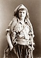 1877 photograph of French actor in costume

- Article(s)
- Les cloches de Corneville
- Request
- This old photograph has developed white dots or speckles all over it. Would it be possible to remove them, please?
- Graphist opinion(s)
![]() Done
PawełMM (
talk) 11:48, 9 November 2018 (UTC)
{{
resolved}}
Thank you very much for doing this so quickly and so beautifully. Greatly obliged.
Tim riley
talk
12:10, 9 November 2018 (UTC)
Done
PawełMM (
talk) 11:48, 9 November 2018 (UTC)
{{
resolved}}
Thank you very much for doing this so quickly and so beautifully. Greatly obliged.
Tim riley
talk
12:10, 9 November 2018 (UTC)
King George VI
{{ resolved}}
-
-
 new png version


- Article(s)
- King George VI
- Request
- png version with border removed, staples and scuffs redacted, called File:Eleanor Roosevelt, King George VI, Queen Elizabeth in London, England - NARA - 195320.png please… -- Kintetsubuffalo ( talk) 05:08, 8 November 2018 (UTC)
- Graphist opinion(s)
![]() Done
PawełMM (
talk)
05:56, 8 November 2018 (UTC)
Done
PawełMM (
talk)
05:56, 8 November 2018 (UTC)
- Thank you!-- Kintetsubuffalo ( talk) 09:48, 10 November 2018 (UTC)
Blue Peter badge
{{ resolved}}
- Article(s)
- Blue Peter badge
- Request
- please trim to shield… -- Kintetsubuffalo ( talk) 09:47, 10 November 2018 (UTC)
- Graphist opinion(s)
- Do you mean a simple rectangular crop, or cut out the background to the edge of the badge? ( Hohum @) 12:40, 10 November 2018 (UTC)
![]() Done
PawełMM (
talk)
13:15, 10 November 2018 (UTC)
Done
PawełMM (
talk)
13:15, 10 November 2018 (UTC)
- Thank you!-- Kintetsubuffalo ( talk) 19:55, 10 November 2018 (UTC)
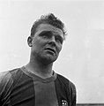
Request: Karoly Honfi
-
 Karoly Honfi

- Article(s)
- Karoly Honfi
- Request
- Less screaming background, if possible. Vysotsky ( talk) 14:39, 10 November 2018 (UTC)
- Graphist opinion(s)
![]() Done
PawełMM (
talk)
17:25, 10 November 2018 (UTC)
Done
PawełMM (
talk)
17:25, 10 November 2018 (UTC)
- Thanks! Vysotsky ( talk) 17:38, 10 November 2018 (UTC) {{ resolved}}
Vehicle registration plates of Australia
{{ resolved}}
- Article(s)
- Vehicle registration plates of Australia
- Request
- please fix perspective, crop and straighten-all plates should be to the ratio 372:134… -- Kintetsubuffalo ( talk) 20:19, 10 November 2018 (UTC)
- Graphist opinion(s)
![]() Done
PawełMM (
talk)
21:57, 10 November 2018 (UTC)
Done
PawełMM (
talk)
21:57, 10 November 2018 (UTC)
- Thank you!-- Kintetsubuffalo ( talk) 01:39, 11 November 2018 (UTC)
Request:Raul Dagenais
-
 Dagenais 1952-1
-
 Dagenais 1952-2
 -
 Dagenais 1952-3
_tegen_Raoul_Dagenais_(,_Bestanddeelnr_905-4331.jpg)


- Article(s)
- Piet Roozenburg
- Request
- Please remove white stains, if possible. Vysotsky ( talk) 23:53, 30 October 2018 (UTC)
- Graphist opinion(s)
![]() Done
PawełMM (
talk)
09:11, 31 October 2018 (UTC)
Done
PawełMM (
talk)
09:11, 31 October 2018 (UTC)
- Thanks! Vysotsky ( talk) 19:23, 11 November 2018 (UTC) {{ resolved}}
Request: Milko Bobotsov
-
 Milko Bobotsov (1)
 -
 Milko Bobotsov (2)
 -
 Milko Bobotsov (3)
_in_zijn_part,_Bestanddeelnr_915-9227.jpg)
,_Bestanddeelnr_918-6665.jpg)
,_Bestanddeelnr_917-3680.jpg)
- Article(s)
- Milko Bobotsov
- Request
- Please remove white stains (if possible). Vysotsky ( talk) 16:42, 10 November 2018 (UTC)
- Graphist opinion(s)
![]() Done
PawełMM (
talk)
18:04, 10 November 2018 (UTC)
Done
PawełMM (
talk)
18:04, 10 November 2018 (UTC)
- Thanks! Vysotsky ( talk) 19:23, 11 November 2018 (UTC) {{ resolved}}
Registration plates of Western Australia
{{ resolved}}
- Article(s)
- Vehicle registration plates of Western Australia
- Request
- Please straighten, fix the perspective of the images, straighten and do any necessary photoshop editing. Please ensure that all the numberplates are at the ratio of 372:134. Much appreciated -- EurovisionNim (talk to me) (see my edits) 09:53, 11 November 2018 (UTC)
![]() Done
PawełMM (
talk)
15:17, 11 November 2018 (UTC)
Done
PawełMM (
talk)
15:17, 11 November 2018 (UTC)
Request: Hans Bouwmeester
-
 Bouwmeester (1)
 -
 Bouwmeester (2)


- Article(s)
- Hans Bouwmeester
- Request
- Please remove white stains, if possible. Vysotsky ( talk) 19:27, 11 November 2018 (UTC)
- Graphist opinion(s)
![]() Done
PawełMM (
talk)
10:30, 12 November 2018 (UTC)
Done
PawełMM (
talk)
10:30, 12 November 2018 (UTC)
- Thanks, for your tireless work. Vysotsky ( talk) 19:52, 12 November 2018 (UTC) {{ resolved}}
Request: Kiki Caron
-
 Kiki Caron

- Article(s)
- Kiki Caron
- Request
- Please remove black spot (if possible). Vysotsky ( talk) 08:45, 12 November 2018 (UTC)
- Graphist opinion(s)
![]() Done
PawełMM (
talk)
09:45, 12 November 2018 (UTC)
Done
PawełMM (
talk)
09:45, 12 November 2018 (UTC)
- Thanks again. Vysotsky ( talk) 19:52, 12 November 2018 (UTC) {{ resolved}}
Request: Tamara Safonova
-
 Tamara Safonova

- Article(s)
- Tamara Safonova
- Request
- Clean-up of white staines, if possible. Vysotsky ( talk) 21:16, 12 November 2018 (UTC)
- Graphist opinion(s)
![]() Done
PawełMM (
talk)
05:36, 13 November 2018 (UTC)
Done
PawełMM (
talk)
05:36, 13 November 2018 (UTC)
- Thanks. Vysotsky ( talk) 10:56, 13 November 2018 (UTC) {{ resolved}}
Dorothea Erxleben Boilerplate do not create a new image as it is not needed.
{{ resolved}}

- Article(s)
- Dorothea Erxleben
- Request
- please trim to oval… Boilerplate do not create a new image as it is not needed.-- Kintetsubuffalo ( talk) 06:00, 13 November 2018 (UTC)
- Graphist opinion(s)
![]() Done
PawełMM (
talk)
07:04, 13 November 2018 (UTC)
Done
PawełMM (
talk)
07:04, 13 November 2018 (UTC)
- Thank you!-- Kintetsubuffalo ( talk) 08:12, 13 November 2018 (UTC)
Filling the holes in the lotus
- Note: If you have an unpleasant reaction to trypophobic images, don't click the links below.
Hi, this is a follow-up to a previous request regarding trypophobic images, which are images that have a particular type of pattern that can cause some viewers acute distress including physical symptoms.
PawełMM, Thanks for the image you provided previously; it is much appreciated, and it engendered much discussion at Talk:Trypophobia#Discussion. After significant back-and-forth about the progressive gif, a new idea was proposed by Flyer22 Reborn ( here) which might help, to wit: filling in the holes, but making sure the pattern is visible.
Flyer would have the last word on exactly what they she would like to see here, but as I envisioned it from her words: imagine the original, fixed image remaining as is, except that all the holes are filled in with an opaque paint color a scant shade darker (or lighter?) than the surrounding pod surface, perhaps eyedropped from the color of the average crater rim surrounding the hole [a] and darkened up just a tiny bit. [b] Around each filled-in hole, there could be a thin (1px?) border line of a slightly contrasting color (#FFDC7C? pick whatever works) outlining the present elliptically-shaped countour of the hole. The overall result should look at first glance like a lotus with the crater rims intact but all the holes gone, but upon closer examination, having a pale vestige of where the holes used to be. If the border ellipses are a pain in the neck, or appear too prominent, maybe it's easier to just use the color fill-in with no border. I'd definitely wait for Flyer to check in, though, before spending any time on this. Thanks, Mathglot ( talk) 02:10, 2 November 2018 (UTC)
Notes
- ^ I eyedroppered a few of the crater rims, and got these: #A2B096, #A3AF99, #A5B399, #ACB8A0, #B9BA98, #C1CAB5.
- ^ Darkened a tiny bit: maybe darker by 080808 or by 101010? Or, maybe lighter by the same amount; would have to see it to see what looks good. For the first crater rim value of #A2B096 XXXXXX , darker by 080808 is #9AA88D XXXXXX , and darker by 101010 is #92A086 XXXXXX . The latter with an #FFDC7C border is XXXXXX .
.jpg)
.jpg)
.jpg)
- @
Mathglot: I do not know if I understood your suggestion of the image well. I am posting my proposal (#1) of a sub-masked image.
PawełMM (
talk)
09:23, 4 November 2018 (UTC)
- Thanks, but I imagined it more like how it might look, if you literally took the lotus and held the pod parallel to the ground, and then carefully poured green paint into each hole, until the paint filled up each hole completely. The little round things and the red tip would all be covered up, "underwater" so to speak. That said, if Flyer hasn't shown up to comment, maybe it's not worth it right now. I thank you for your effort!
Mathglot (
talk)
10:02, 4 November 2018 (UTC)
- @
Mathglot: I made one more proposal (#2).
PawełMM (
talk)
11:30, 4 November 2018 (UTC)
- Thanks,
PawełMM; it's being discussed now
here.
Mathglot (
talk)
21:56, 4 November 2018 (UTC)
- @ Mathglot: I made one more proposal (#3). This is probably my last suggestion of a filling look... PawełMM ( talk) 06:51, 5 November 2018 (UTC)
- Thanks,
PawełMM; it's being discussed now
here.
Mathglot (
talk)
21:56, 4 November 2018 (UTC)
- @
Mathglot: I made one more proposal (#2).
PawełMM (
talk)
11:30, 4 November 2018 (UTC)
- Thanks, but I imagined it more like how it might look, if you literally took the lotus and held the pod parallel to the ground, and then carefully poured green paint into each hole, until the paint filled up each hole completely. The little round things and the red tip would all be covered up, "underwater" so to speak. That said, if Flyer hasn't shown up to comment, maybe it's not worth it right now. I thank you for your effort!
Mathglot (
talk)
10:02, 4 November 2018 (UTC)
Yodgor Nasriddinova

- Article(s)
- Yodgor Nasriddinova
- Request
- Please remove watermarks. Thanks! -- SusunW ( talk) 17:01, 11 November 2018 (UTC)
- Graphist opinion(s)
![]() Done
PawełMM (
talk)
06:40, 12 November 2018 (UTC)
{{
resolved}}
Done
PawełMM (
talk)
06:40, 12 November 2018 (UTC)
{{
resolved}}
Georgetown
{{ resolved}}
-
-
 png file
_-_Capital_Traction_Company_Union_Station,_3600_M_HABS_DC,GEO,84-10.png)
- Article(s)
- Georgetown
- Request
- please create png version, straightened and trimmed, same name except extension… -- Kintetsubuffalo ( talk) 02:38, 15 November 2018 (UTC)
- Graphist opinion(s)
![]() Done
PawełMM (
talk)
07:02, 15 November 2018 (UTC)
Done
PawełMM (
talk)
07:02, 15 November 2018 (UTC)
- Thank you!-- Kintetsubuffalo ( talk) 16:02, 15 November 2018 (UTC)
The Abolition of Man
{{ resolved}}

- Article(s)
- The Abolition of Man
- Request
- please remove background… -- Kintetsubuffalo ( talk) 02:45, 15 November 2018 (UTC)
- Graphist opinion(s)
![]() Done
PawełMM (
talk)
06:43, 15 November 2018 (UTC)
Done
PawełMM (
talk)
06:43, 15 November 2018 (UTC)
- Fantastic, thank you!-- Kintetsubuffalo ( talk) 16:01, 15 November 2018 (UTC)
Fern Andra
{{ resolved}}
-
 jpg
jpg -
 png
png


- Article(s)
- Fern Andra
- Request
- please fix contrast between her and the background, and straighten… -- Kintetsubuffalo ( talk) 20:53, 14 November 2018 (UTC)
- Graphist opinion(s)
![]() Done In my opinion, the contrast in this photograph should not change. This is an image made with the
low key technique.
PawełMM (
talk)
07:45, 15 November 2018 (UTC)
Done In my opinion, the contrast in this photograph should not change. This is an image made with the
low key technique.
PawełMM (
talk)
07:45, 15 November 2018 (UTC)
-
PawełMM Then please create a separate png version with fixed contrast between her and the background, same name except extension, as technique aside the subject needs to be seen better. That way the original can preserve the technique if it's important.--
Kintetsubuffalo (
talk)
16:09, 15 November 2018 (UTC)
- Kintetsubuffalo Done as requested. PawełMM ( talk) 17:36, 15 November 2018 (UTC)
- Thank you!-- Kintetsubuffalo ( talk) 06:05, 16 November 2018 (UTC)
Francis Robert Benson Boilerplate do not create a new image as it is not needed.
{{ resolved}}

- Article(s)
- Francis Robert Benson
- Request
- please remove stray edging… Boilerplate do not create a new image as it is not needed.-- Kintetsubuffalo ( talk) 15:58, 15 November 2018 (UTC)
- Graphist opinion(s)
![]() Done
PawełMM (
talk)
16:45, 15 November 2018 (UTC)
Done
PawełMM (
talk)
16:45, 15 November 2018 (UTC)
- Thank you!-- Kintetsubuffalo ( talk) 17:10, 15 November 2018 (UTC)
Georgetown Car Barn
{{ resolved}}
-

-
 png version- PawełMMcan you crop this one closer?
 -
-
 png version
_Entry_-_Capital_Traction_Company_Union_Station,_3600_M_Street_Northwest,_Washington,_HABS_DC,GEO,84-3.png)
_-_Capital_Traction_Company_Union_Station,_3600_M_Street_Northwest_HABS_DC,GEO,84-11.png)
- Article(s)
- Georgetown Car Barn
- Request
- please create png versions, straightened and trimmed, same name except extension… -- Kintetsubuffalo ( talk) 16:12, 15 November 2018 (UTC)
- Graphist opinion(s)
![]() Done
PawełMM (
talk)
17:23, 15 November 2018 (UTC)
Done
PawełMM (
talk)
17:23, 15 November 2018 (UTC)
-
Kintetsubuffalo Done as requested.
PawełMM (
talk)
06:32, 16 November 2018 (UTC)
- Thank you!-- Kintetsubuffalo ( talk) 06:34, 16 November 2018 (UTC)
Request: Remembrance
-
 Grave of a war pilot

- Article(s)
- Commonwealth War Graves Commission
- Request
- Please remove white stain upper left and black stain down right, if possible. Vysotsky ( talk) 09:04, 15 November 2018 (UTC)
- Graphist opinion(s)
![]() Done
PawełMM (
talk)
10:05, 15 November 2018 (UTC)
Done
PawełMM (
talk)
10:05, 15 November 2018 (UTC)
- Thanks. Vysotsky ( talk) 09:33, 16 November 2018 (UTC) {{ resolved}}
Request: Memorial


- Article(s)
- Airborne-monument (Arnhem)
- Request
- Please remove white stains, if possible. Vysotsky ( talk) 12:33, 16 November 2018 (UTC)
- Graphist opinion(s)
![]() Done
PawełMM (
talk)
13:58, 16 November 2018 (UTC)
Done
PawełMM (
talk)
13:58, 16 November 2018 (UTC)
- Thanks! Vysotsky ( talk) 15:55, 16 November 2018 (UTC) {{ resolved}}
Borgward
{{ resolved}}
- Article(s)
- Borgward
- Request
- please rotate slightly to straight… -- Kintetsubuffalo ( talk) 19:46, 5 November 2018 (UTC)
- Graphist opinion(s)
![]() Done
PawełMM (
talk) 06:01, 6 November 2018 (UTC)
Done
PawełMM (
talk) 06:01, 6 November 2018 (UTC)
:
PawełMM the center is still not upright, very close though--
Kintetsubuffalo (
talk)
15:48, 17 November 2018 (UTC)
- It may just be perspective. Thank you!--
Kintetsubuffalo (
talk)
15:51, 17 November 2018 (UTC)
- Kintetsubuffalo Done as requested. PawełMM ( talk) 16:02, 17 November 2018 (UTC)
- It may just be perspective. Thank you!--
Kintetsubuffalo (
talk)
15:51, 17 November 2018 (UTC)
Mr. Blue Sky
{{ resolved}}

- Article(s)
- Mr. Blue Sky
- Request
- please rotate to straight… -- Kintetsubuffalo ( talk) 09:01, 6 November 2018 (UTC)
- Graphist opinion(s)
![]() Done
PawełMM (
talk)
12:50, 6 November 2018 (UTC)
Done
PawełMM (
talk)
12:50, 6 November 2018 (UTC)
- Recent one better, thank you!-- Kintetsubuffalo ( talk) 15:49, 17 November 2018 (UTC)
Teresa Sampsonia
{{ resolved}}
-
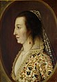 Teresia, Countess of Shirley, painted c. 1611-1613)

- Article(s)
- Teresa Sampsonia
- Request
- Hi there. The frame in this [1] image is three dimentional, so its not PD; according to the FA review the article is receiving as we speak, it needs to be cropped out. PS: please overwrite the same file. Thanks, -- LouisAragon ( talk) 16:19, 10 November 2018 (UTC)
- Graphist opinion(s)
(I moved this here from the illustration workshop. TilmannR ( talk) 15:39, 12 November 2018 (UTC))
![]() Done
PawełMM (
talk)
17:21, 12 November 2018 (UTC)
Done
PawełMM (
talk)
17:21, 12 November 2018 (UTC)
woggle
{{ resolved}}


- Article(s)
- woggle
- Request
- please remove outside and center background… -- Kintetsubuffalo ( talk) 08:38, 17 November 2018 (UTC)
- Graphist opinion(s)
![]() Done
PawełMM (
talk)
10:10, 17 November 2018 (UTC)
Done
PawełMM (
talk)
10:10, 17 November 2018 (UTC)
- Great, thank you!-- Kintetsubuffalo ( talk) 15:53, 17 November 2018 (UTC)
Image restoration academy page of MILHIS project
Hello all, the Military History WikiProject started an internal project audit last year. As a part of it, we're revamping the academy pages, which contains an incomplete page on image restoration. It would great if one (or some) of you can expand the page by sharing the knowledge you've about image restoration. This'll hopefully help new users to get a better understanding about the concept. KCVelaga ( talk) 15:16, 19 October 2018 (UTC)
- @ KCVelaga: That's kind of a huge subject, it's hard to know where to begin with it. There's a lot of judgement and "stuff that works only in specific situations" too. I'm not real sure that advising a brand newb on how best to restore photos is a particularly effective strategy. It would be better to come here, even for "training" purposes. Some of the volunteers here (including myself) would be happy to explain in detail what we did and why to restore images posted here. ᛗᛁᛟᛚᚾᛁᚱPants Tell me all about it. 16:40, 19 October 2018 (UTC)
neckerchief
{{ resolved}}


- Article(s)
- neckerchief
- Request
- please split into 4 files, remove background and straighten, named File:21st World Scout Jamboree neckerchief (top rainbow); File:Cumberland Gang Show, New South Wales neckerchief (right red); File:1st Cherrybrook Scout Group, New South Wales neckerchief (bottom brown); and File:Scouts Australia national neckerchief -2017 (left ochre)… -- Kintetsubuffalo ( talk) 18:23, 17 November 2018 (UTC)
- Graphist opinion(s)
![]() Done
PawełMM (
talk)
10:31, 18 November 2018 (UTC)
Done
PawełMM (
talk)
10:31, 18 November 2018 (UTC)
- Fantastic, thank you!-- Kintetsubuffalo ( talk) 17:10, 18 November 2018 (UTC)
Sirimavo Bandaranaike
{{ resolved}}
-
 Sirimavo Bandaranaike 1961
 -

-

-

-

-

-

-


_1.PNG)
_2.PNG)
_3.PNG)
_4.PNG)
_5.PNG)
_6.PNG)
_7.PNG)
- Article(s)
- Sirimavo Bandaranaike
- Request
- Is it possible to split each of these images into 7 individual photographs? Thank you! -- SusunW ( talk) 20:37, 17 November 2018 (UTC)
- Graphist opinion(s)
![]() Done
PawełMM (
talk)
08:21, 18 November 2018 (UTC)
Done
PawełMM (
talk)
08:21, 18 November 2018 (UTC)
- You are awesome. Thank you so very, very much! SusunW ( talk) 16:10, 18 November 2018 (UTC)
Request: László Kubala
-
 László Kubala
,_Bestanddeelnr_906-0012.jpg)
- Article(s)
- László Kubala
- Request
- Please remove white stains and spickles, if possible. Vysotsky ( talk) 00:18, 18 November 2018 (UTC)
- Graphist opinion(s)
![]() Done
PawełMM (
talk)
07:19, 18 November 2018 (UTC)
Done
PawełMM (
talk)
07:19, 18 November 2018 (UTC)
- Thanks. Vysotsky ( talk) 13:40, 21 November 2018 (UTC) {{ resolved}}
Gerhard Fieseler
{{ resolved}}
-
 PawełMM please mask out name
 -

-


- Article(s)
- Gerhard Fieseler
- Request
- please mask out name and/or remove edge watermarks… -- Kintetsubuffalo ( talk) 21:13, 16 November 2018 (UTC)
- Graphist opinion(s)
![]() Done
PawełMM (
talk)
21:52, 16 November 2018 (UTC)
Done
PawełMM (
talk)
21:52, 16 November 2018 (UTC)
- Thank you!-- Kintetsubuffalo ( talk) 22:17, 21 November 2018 (UTC)
Tolkien
{{ resolved}}


- Article(s)
- Tolkien
- Request
- please rotate to straight and fix perspective… -- Kintetsubuffalo ( talk) 22:16, 21 November 2018 (UTC)
- Graphist opinion(s)
![]() Done
PawełMM (
talk)
04:20, 22 November 2018 (UTC)
Done
PawełMM (
talk)
04:20, 22 November 2018 (UTC)
- Thanks! Can you trim left and right background on the first one so it doesn't look blotchy?--
Kintetsubuffalo (
talk)
08:10, 22 November 2018 (UTC)
- @ Kintetsubuffalo: Done as requested. PawełMM ( talk) 13:20, 22 November 2018 (UTC)
- Thanks again!-- Kintetsubuffalo ( talk) 19:43, 22 November 2018 (UTC)
Katherine Plunket
{{ resolved}}
- Article(s)
- Katherine Plunket
- Request
- this is terrible, can someone please salvage this?… -- Kintetsubuffalo ( talk) 08:07, 22 November 2018 (UTC)
- Graphist opinion(s)
-
Kintetsubuffalo: I tried. You can always restore the older version.
PawełMM (
talk)
13:40, 22 November 2018 (UTC)
- It is better, thanks!-- Kintetsubuffalo ( talk) 19:45, 22 November 2018 (UTC)
Request: Ferenc Portisch
-
 Ferenc Portisch (1973)

- Article(s)
- Ferenc Portisch
- Request
- Please remove stain (if possible). Vysotsky ( talk) 12:05, 23 November 2018 (UTC)
- Graphist opinion(s)
![]() Done
PawełMM (
talk)
14:18, 23 November 2018 (UTC)
Done
PawełMM (
talk)
14:18, 23 November 2018 (UTC)
- Thanks! Vysotsky ( talk) 22:09, 23 November 2018 (UTC) {{ resolved}}
Machito and his sister Graciella Grillo
{{ resolved}}
-
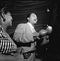 Portrait of Machito and Graciella Grillo, Glen Island Casino, New York, N.Y., ca. July 1947

- Article(s)
- Afro-Cuban jazz
- Request
- Please crop the black border. -- Squandermania ( talk) 23:27, 16 November 2018 (UTC)
- Graphist opinion(s)
![]() Done
PawełMM (
talk)
06:09, 17 November 2018 (UTC)
Done
PawełMM (
talk)
06:09, 17 November 2018 (UTC)
Paul Martin (illustrator)

- Article(s)
- Paul Martin (illustrator)
- Request
- Need better image; less toned, stronger focus -- Jim Percy ( talk) 23:04, 28 October 2018 (UTC)
Hello. I uploaded this envelope with company cachet, about six months ago. The original (subpar) camera shot was uploaded to a CD. The shot is problematic due to its awkward positioning, which also clipped off part of the lower left corner (of envelope). It can't be redone (age factor of other party). Details are explained in the description line at https://commons.wikimedia.org/wiki/File:OJGude.jpg. It's important to save, as contains original info which would be otherwise lost to history. The building should be standing upright and not be slanted downward, but reckon nothing can be done about that (as it would alter other parts of cachet). It backs up detail in the Wikipedia article "Paul Martin (illustrator)." The letter is reachable there through references #128 & 210. Anyway, I was hoping that someone at "Commons" can lighten it up while increasing its sharpness. The envelope looks too dark. I think it would look more presentable if lightened up. I don't have the ability to make any proper correction with my basic image editor. I can lighten it up, but then unfortunately, the text/image also becomes lighter. The words "Drawn by P.M" on the envelope are in pencil, but should be darker. The image size is purposely very large to make editing easier. In reality, it should be downsized to no lower than 1024 x 768 pixels. Thanks. Jim Percy ( talk) 23:04, 28 October 2018 (UTC)
- Graphist opinion(s)
![]() Done Howzat?
ᛗᛁᛟᛚᚾᛁᚱPants
Tell me all about it.
00:23, 29 October 2018 (UTC)
Done Howzat?
ᛗᛁᛟᛚᚾᛁᚱPants
Tell me all about it.
00:23, 29 October 2018 (UTC)
- @ MjolnirPants: Thanks for adjusting the colors. That does look much better. I might downsize it just a spec later, on my own (from 3285 x 1373 pixels). OTOH. I've noticed some cachet envelopes on Commons in the MB size range. BTW. I touched up part of my above request while you were working on the image, but it didn't change anything important. Jim Percy ( talk) 00:31, 29 October 2018 (UTC)
Request: Theo van Gogh
-
 Theo van Gogh

- Article(s)
- Theo van Gogh (art dealer)
- Request
- Please remove number (if possible without cropping). Vysotsky ( talk) 21:39, 29 November 2018 (UTC)
- Discussion
 Done. I uploaded in 2 steps - [1] just label removal, [2] minimal cleanup - so that you can easily revert the second step if not desired. --
Begoon
23:33, 29 November 2018 (UTC)
Done. I uploaded in 2 steps - [1] just label removal, [2] minimal cleanup - so that you can easily revert the second step if not desired. --
Begoon
23:33, 29 November 2018 (UTC)
- Thanks. Vysotsky ( talk) 00:41, 30 November 2018 (UTC) {{ resolved}}