| This is an
archive of past discussions for the period 2015. Do not edit the contents of this page. If you wish to start a new discussion or revive an old one, please do so on the current main page. |

Stale Information
-
 The outdated (for now) map of the Montreal subway system

Hello. The last update of the map was in 2013. Since then, Square-Victoria was renamed to Square-Victoria–OACI. It would also be good for the code to be cleaned up. Thanks, ~~ Ebe 123~~ → report 01:54, 18 October 2014 (UTC)
- DO you know what is the font used?
///EuroCar
GT
20:39, 18 October 2014 (UTC)
- The Calibri-font. For linux-users, this can be replaced with the Carlito-font. Wereldburger758 ( talk) 06:30, 19 March 2015 (UTC)
Resolved Information
Map of Australia and New Zealand with an inset.
-
 This is the original map, utilised in the articles

- Article(s)
- 2014–15 A-League
- Request

- The above is how the map currently looks in the 2010–11 A-League.
- Below is how the map looks in the current 2014–15 A-League season.
- {{ A-League 2014-2015 map}}
- Each A-League season's pages contain a map with icons showing the geographical locations of the teams in the A-League. I have no issues about aligning these myself, the only problem I'm having is that they appear quite cramped around the Sydney region where there are currently four teams (which could extend to as many as six soon). I think this would look a lot better with an inset on the map magnifying Brisbane, Sydney, Melbourne and Canberra; or even just around Sydney and Canberra, with the inset perhaps placed in the blank top right area of the map above New Zealand.
- Perhaps we could even utilise a slightly larger map? I'm pretty flexible. Whatever you guys think would look best. --
J man708 (
talk)
23:36, 29 December 2014 (UTC)
- Just gonna bump this to avoid it from being archived --
J man708 (
talk)
05:44, 7 January 2015 (UTC)
- @ J man708: You don't need to do that - there is no automatic archiving on this page, it's a manual job ( example). -- Redrose64 ( talk) 14:45, 7 January 2015 (UTC)
- Just gonna bump this to avoid it from being archived --
J man708 (
talk)
05:44, 7 January 2015 (UTC)
- Graphist opinion(s)
![]() Request taken by
Goran tek-en (
talk)
16:05, 2 March 2015 (UTC).
Request taken by
Goran tek-en (
talk)
16:05, 2 March 2015 (UTC).
@
J man708: Now I have started on this and I will make a svg image for this.
- Is the different teams "flags" their colors but with the same width for the different areas for them all?
- Do you have the colors for the different teams in some standards, rgb, hexadecimal or other? --
Goran tek-en (
talk)
19:58, 2 March 2015 (UTC)
- @ Goran tek-en: Yeah, each team has a their own colour flag on file along here. Unfortunately, I have no idea what hex codes or anything like that were used in creating it (On checking, they all appear to be 60x60px and all seem to be vertical tricolours). I do know that they've been used for a long time on here, however. I suppose we could make updated versions of the colours and have them better matching the team colours ( Western Sydney Wanderers FC for instance use vertical stripes on their kit. I might bring this up with the Australian soccer taskforce at a later date.
- Also worth nothing that this map would probably also be used on the
W-League (Australia) page, I assume, where there are clubs in different locations to the men's comp. Sorry if I'm not helpful! -
J man708 (
talk)
05:10, 4 March 2015 (UTC)
- A manual solution to this problem could be something like the map at 2015 Campeonato Brasileiro Série A. Hack ( talk) 05:26, 4 March 2015 (UTC)
OK so I guess we have to start with to decide what kind of map you want.
- I can make an svg version (larger in px if you want) with an inset of your selection of current map. Then you can use that in the same manner as you already are working.
- I can make a svg version (larger in px if you want) with the different teams placed in the map. If so then you will be depending on someone making a new version all the time if you don't work with svg files. Also at this point I'm not sure if wikimedia allows links within a svg file like you are linking the teams right now.
Tell me which you want or other ideas, thanks. -- Goran tek-en ( talk) 15:20, 4 March 2015 (UTC)
- @ Goran tek-en: Sorry, been away from Wikipedia quite a lot this week. I think the first one would be better, considering that the teams have changed sometimes season by season, plus that allows for direct links to the individual club articles. A version using more pixels (and indeed larger) would be a good idea, I would say. :) - J man708 ( talk) 11:45, 7 March 2015 (UTC)
- @
J man708: Now there is
a draft to look at. Give me feedback, thanks. --
Goran tek-en (
talk)
20:10, 8 March 2015 (UTC)
- @
Goran tek-en: That map is awesome! The only thing I've noticed is the state border between
South Australia and
Victoria (Look around South Eastern Australia) being a solid line, with all the other state borders being shown as dashes. Do you know how this will look when it's a bit smaller? Other than that, it looks awesome! Thanks! :D -
J man708 (
talk)
15:05, 10 March 2015 (UTC)
- @
J man708: Now there is
a draft to look at.
- The map you is using right now is 438px wide. This new svg map is 1499px wide. I have made three png versions in different width
700px,
500px,
250px so yoy can look at them. Get back to me if you wan't anything else changed.
- When we are done I will need the following;
- Name of the file
- Description
- Category/ies at commons
- to be able to upload it at commons. --
Goran tek-en (
talk)
15:00, 11 March 2015 (UTC)
- @ Goran tek-en: I think the 500 or the 700 are both great sizes for the article. Thanks a bunch for this! Sorry, but what do you mean by the file name, description on commons categories info? - J man708 ( talk) 14:26, 12 March 2015 (UTC)
- @
J man708: Now there is
a draft to look at.
- @
Goran tek-en: That map is awesome! The only thing I've noticed is the state border between
South Australia and
Victoria (Look around South Eastern Australia) being a solid line, with all the other state borders being shown as dashes. Do you know how this will look when it's a bit smaller? Other than that, it looks awesome! Thanks! :D -
J man708 (
talk)
15:05, 10 March 2015 (UTC)
- @
J man708: Now there is
a draft to look at. Give me feedback, thanks. --
Goran tek-en (
talk)
20:10, 8 March 2015 (UTC)
@ J man708: Commons is the place were all images, sounds, videos and so on are stored. This so all other Wikimedia projects and people outside of this can find and use this free material. To be able to upload it there I need that information. You have to decide for an imagename.svg and check so it doesn't already exist at commons. Then I need a Description of what the image shows/contains so other people can find it. At Commons the content is organized also by using different Categories. It's not always easy to find the right one but this page helps you with that. This information must come from you because it's your topic, I have no knowledge of it. Also Commons generates a couple of different sizes png that you can use. Get back to me, thanks. -- Goran tek-en ( talk) 14:28, 13 March 2015 (UTC)
- @
Goran tek-en: Sorry, completely missed the notification on this one! I guess a good name could be something like "Map of Australia and New Zealand with Eastern Inset" or something similar? The name you used before of "Map of Australia and New Zealand with an inset.svg" is also perfect! Is it bad for the file description to copy the name of the file itself? "Map of Australia and New Zealand with Eastern Inset" really does sum it up as well as it can be done, I think! :P The original map is located
here. Unfortunately, I've never dealt with Commons and have no real idea as to what I'm doing, or which categories the specific images would be suited to. I really am less than useless here! Sorry Goran tek-en!
- J man708 ( talk) 16:46, 22 March 2015 (UTC)- @ J man708: Now you can find it here Map of Australia and New Zealand with an inset -- Goran tek-en ( talk) 10:03, 24 March 2015 (UTC)
![]() Done
Done
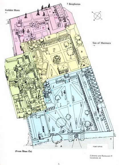
Topkapi palace unified map
-
 Plan of the Harem of Topkapı Palace
 -
 another plan of the Harem of Topkapı Palace
 -
 Plan of courtyard 2,3,4
 -
 A model of courtyard 2,3,4
 -
 A model of the whole palace

.svg)

.JPG)
.JPG)
- Article(s)
- Topkapı_Palace
- Request
- The Topkapi palace article has no good overall map. Ideally it would have a SVG map of all the courtyards and with all the details, of which an overview is shown in the beginning of the article and then excerpts whenever the article mentions specific courtyards or buildings. Of course this is a lot of work, but it is worth it! Plus I'd guess it is among the more satisfying work here. I'd really like to do it myself, but see no opening in my calendar for the foreseeable future. :-( Note: I have the greatest respect for the person who did /info/en/?search=Wikipedia:Graphics_Lab/Map_workshop/Archive/March_2014#Red_Fort ! Wow! If something like this could be achieved, i'd be more than happy. Thank you in advance. -- Lommes ( talk) 22:20, 8 January 2015 (UTC)
- Graphist opinion(s)
@ Lommes: Please can you specify exactly which diagrams you want, e.g. Harem, Courtyard, blah blah. Thanks. Philg88 ♦ talk 07:25, 15 January 2015 (UTC)
- @
Philg88:Most important, imho, would be an overall map of the whole palace, that is corresponding to the last image of the model. Ideally, but not necessarily, it would be so detailed that one could use parts of this overall map to illustrate the different courtyards and the harem. I think it would be generally useful to color-code the courtyards in pastel colours (see
http://www.istanbulextralarge.com/topkapi-palace.html for a satellite image of where which courtyard is located). I am not sure if I answered your question satisfactorily, if not please specify what I did not answer. Thanks very much in advance.
Lommes (
talk)
13:50, 15 January 2015 (UTC)
- I just found
http://www.internetstones.com/image-files/topkapi-palace-layout-ilban-oz-2.jpg which does the pastel colour thing i described above. Of course, which colours you use is entirely up to you. I just proposed pastel colours, so one can still use fully saturated colours to show other features, if needed.
Lommes (
talk)
13:57, 15 January 2015 (UTC)
- @
Lommes: OK, leave it with me for a few days and I'll see what I can do. Cheers,
Philg88 ♦
talk
15:01, 15 January 2015 (UTC)
- @ Lommes: The situation can only get better. Thanks a lot for taking this up. Cheers! Lommes ( talk) 15:08, 15 January 2015 (UTC)
- @
Lommes: OK, leave it with me for a few days and I'll see what I can do. Cheers,
Philg88 ♦
talk
15:01, 15 January 2015 (UTC)
- I just found
http://www.internetstones.com/image-files/topkapi-palace-layout-ilban-oz-2.jpg which does the pastel colour thing i described above. Of course, which colours you use is entirely up to you. I just proposed pastel colours, so one can still use fully saturated colours to show other features, if needed.
Lommes (
talk)
13:57, 15 January 2015 (UTC)
- @
Philg88:Most important, imho, would be an overall map of the whole palace, that is corresponding to the last image of the model. Ideally, but not necessarily, it would be so detailed that one could use parts of this overall map to illustrate the different courtyards and the harem. I think it would be generally useful to color-code the courtyards in pastel colours (see
http://www.istanbulextralarge.com/topkapi-palace.html for a satellite image of where which courtyard is located). I am not sure if I answered your question satisfactorily, if not please specify what I did not answer. Thanks very much in advance.
Lommes (
talk)
13:50, 15 January 2015 (UTC)
@ Lommes: How about this→ for the overview map?

Philg88 ♦ talk 07:30, 24 January 2015 (UTC)
- @
Philg88: Wow, that is great! Some further suggestions:
- I am not sure about the green parts, it is imho not clear enough what they mean.
- I also would ask you to expand the grey area all around, as the first court is a park surrounding all of the other courts.
- The colours of the second and third court are not distinct enough.
- Besides that, it is just great. THANKS a lot!!-- Lommes ( talk) 11:44, 24 February 2015 (UTC)
- @
Lommes: So how about:
- Remove the green
- Surround the whole palace in grey
- Darken the second and third court colours.
- Let me know and I'll fix it up. Cheers,
Philg88 ♦
talk
12:47, 24 February 2015 (UTC)
- @
Philg88: sounds just great!--
Lommes (
talk)
13:21, 24 February 2015 (UTC)
- OK, leave it with me and I'll let you know when it's done. Philg88 ♦ talk 17:27, 24 February 2015 (UTC)
- @
Philg88: sounds just great!--
Lommes (
talk)
13:21, 24 February 2015 (UTC)
- @
Lommes: So how about:
@ Lommes: New version uploaded. Please see the updated thumbnail. Philg88 ♦ talk 06:59, 6 March 2015 (UTC)
- @ Philg88: It is very good, but would it be a problem to make either the 2nd or the 3rd court green? Maybe my monitor is just badly calibrated, but the colors still look very very similar. Besides that, I am perfectly happy with your work and thank you a lot.-- Lommes ( talk) 16:59, 6 March 2015 (UTC)
@
Lommes: ![]() Done Please mark this request as {{
resolved}} if you're happy. Cheers,
Philg88 ♦
talk
17:15, 6 March 2015 (UTC)
Done Please mark this request as {{
resolved}} if you're happy. Cheers,
Philg88 ♦
talk
17:15, 6 March 2015 (UTC)
- @ Philg88: Thanks a lot! Cheers!-- Lommes ( talk) 17:38, 6 March 2015 (UTC)
English language, accent and dialect maps
- Article(s)
- English language
- Request
Hi graphists, I am in need of some good maps for the article on English language. Particulary i need maps showing the major British English dialects (Northern (including Geordie), West Midlands, East Midlands, Anglian, Southern, Westcountry. Something like this [1]), the major American English dialects (General American, Southern, New England, Middle Atlantic, West, Midwest, Northern Cities. something like this [2], or this [3] - for American English the distinctions depend on whether it is based on vocabulary or pronunciation, and there are three sources, Carver, Trudgill and Labov) and the main world English varieties (British, Scots, Irish, American, Australian, NZ, Indian, Carribbean, South African). It is not going to be easy because it requires putting together maps from a lot of different sources and sometimes with many overlapping areas. If someone is willing to help me with this it would be a great addition for wikipedia. ·maunus · snunɐɯ· 20:18, 4 March 2015 (UTC)
- This is a great map of the British English dialects areas [4] ·maunus · snunɐɯ· 01:06, 9 March 2015 (UTC)
- Graphist opinion(s)
OK
![]() Request taken by
Goran tek-en (
talk)
19:15, 19 March 2015 (UTC). but you have to rewrite the request, and JUST give me the information I need.
Request taken by
Goran tek-en (
talk)
19:15, 19 March 2015 (UTC). but you have to rewrite the request, and JUST give me the information I need.
- Tell how many maps you want?
- Give me exact sources for each one and necessary information. Not variations on maps "like this or this or this", just what I need.
- Remember that I know nothing of this subject, keep it simple and exact. -- Goran tek-en ( talk) 19:15, 19 March 2015 (UTC)
- Yeah, I realized that this would require someone with knowledge of the subject, so I made the map myself. I meant to cancel this request but never got to it. Sorry, but you can disregard this request and check it as solved. ·maunus · snunɐɯ· 19:29, 19 March 2015 (UTC)
![]() Done:
Done:
Trying not to make a big thing out of Israel

_new.svg)
I would be really grateful if someone could, perhaps by creating a copy of image File:ISR orthographic.svg, remove the additional shading and lines and the magnified image and then center the remaining content so as to match other images in commons:Category:SVG locator maps of countries of Asia (green and grey globe scheme). This is per discussion at Talk:Israel#What is happening with the maps? My thinking is to allow the graphic to present an untampered image of just how small the region presented as Israel really is. Many thanks. Greg Kaye 16:23, 26 March 2015 (UTC)
![]() Done
Wereldburger758 (
talk)
21:20, 28 March 2015 (UTC)
Done
Wereldburger758 (
talk)
21:20, 28 March 2015 (UTC)
London County Council Sewer Map
-
An image identical(ish) to this, but of a decent size (see the first upload, not the current version)
- Article(s)
- Great Stink
- Request
- Hi, I hope someone can help. I need a map of London the path taken by the main sewers that were built in 1858-75. The map shown in the gallery is great, as it shows the main streets and the sewers we need to show in heavy black, but it fails one of the bizzare bits of copyright law. While the gallery image my be a bit too complicated in what it shows, these ( [5], [6], [7], [8]) are probably a bit too basic, so some happy medium would be great. Feel free to ping if you need any more info or input from me - I can email you the main files of they are deleted from the servers before anyone gets a chance to look at it. Cheers - SchroCat ( talk) 08:48, 3 March 2015 (UTC)
- One possibility is to use an existing PD map of London from some time in the 1850s -1900 to use as a base, and then lie the path of the sewers over the top, which may be an easier way to produce it. - SchroCat ( talk) 08:56, 5 March 2015 (UTC)
- Many thanks Philg88, please let me know if there is anyway I can help with this. Cheers - SchroCat ( talk) 08:11, 9 March 2015 (UTC)
- Many thanks Philg88; I think we're almost perfect on the first attempt! The only tiny tweak I can ask for is for the main outfall sewer to extend a tiny shade so it touches the Thames. Can you also add "BECKTON" at the point it does too?
- Can I ask for one alternative, one of which may or may not work? Is it possible to put an outline of the city on there, to show the extent of the system within metropolis? (You can see on this that there is a thin dotted line around the edge (labelled "London", just by Hampstead); it's partly because people are always surprised how small the city was until relatively recently.
- The second point may or may not work, but I think it may be worth a try. If it doesn't work, this one is excellent. Many, many thanks! - SchroCat ( talk) 09:49, 13 March 2015 (UTC)
- Perfect! Many thanks and I'll drop it in the article now. Cheers – SchroCat ( talk) 17:23, 13 March 2015 (UTC)
- Graphist opinion(s)
-
 Request taken. One of my favourite subjects
 Philg88 ♦
talk
06:51, 6 March 2015 (UTC)
Philg88 ♦
talk
06:51, 6 March 2015 (UTC)
- @
SchroCat: Please take a look at the first draft shown right. Look forward to your comments. Cheers,
09:29, 13 March 2015 (UTC)

- @ SchroCat: There you go. Philg88 ♦ talk 17:11, 13 March 2015 (UTC)
- @
SchroCat: Please take a look at the first draft shown right. Look forward to your comments. Cheers,
09:29, 13 March 2015 (UTC)

Can you please help.

I am hoping to get a colour added to Golan heights and East Jerusalem so as to differentiate them from the within armistice line territory claimed by Israel so as to distinguish them in a similar way as the West Bank. I personally think that a similar colour would do. All as per discussions Talk:Israel#Colouration proposal re: File:Israel districts.png and File talk:Israel districts.png#Proposal for colour changes. Thanks. Greg Kaye 18:02, 20 March 2015 (UTC)
@ GregKaye: Please use the "—New request—" link at the top of this page as that will give us all the code we need, thanks. -- Goran tek-en ( talk) 18:28, 20 March 2015 (UTC)
![]() Done
Maproom (
talk)
19:29, 20 March 2015 (UTC)
Done
Maproom (
talk)
19:29, 20 March 2015 (UTC)
- Excellent. There have been some negative comments about the addition of the extra colour but nothing that I can see that has a basis in guidelines. Another editor had noted that a colour difference between Golan, East Jerusalem and the West Bank would be called for. Greg Kaye 16:26, 26 March 2015 (UTC)
Switch the colors
-
 Map of Catholic dioceses in Pennsylvania
- Article(s)
- List of Catholic bishops of the United States, Roman Catholic Archdiocese of Philadelphia
- Request
- Please switch the colors of the Erie and Scranton dioceses (northwestern and northeastern corners, respectively); with my colorblindness, it's nearly impossible for me to distinguish Erie from Pittsburgh and Scranton from Allentown. I downloaded the SVG and tried to edit the colors in Notepad, but it was too complex for me to handle confidently. Nyttend ( talk) 05:45, 31 March 2015 (UTC)
 Done.
Maproom (
talk)
14:27, 31 March 2015 (UTC)
Done.
Maproom (
talk)
14:27, 31 March 2015 (UTC)
- Graphist opinion(s)
I'll do this in the next few hours, unless someone else gets here first. I see that the colours have been deliberately arranged so that similar colours are adjacent. This seems to me perverse – I plan to change it. Maproom ( talk) 06:37, 31 March 2015 (UTC)
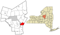
Requesting maps of Oneida and Erie Counties, NY, USA
-
 Example of county image
 -

-


- Article(s)
- Oneida County, New York, Erie County, New York
- Request
- This request concerns the creation of 2 blank SVG files of both Erie County, New York and Oneida County, New York. Requesting that municipal borders are displayed, with the county seats Buffalo and Utica be colored in. Thank you in advance. -- Buffaboy ( talk) 02:17, 22 March 2015 (UTC)
- Graphist opinion(s)
![]() Request taken by
Buffaboy (
talk) 06:00, 29 March 2015 (UTC). Ive decided to try this myself, and it will be a big learning experience for me. I'll have the finished product back here at some point.
Buffaboy (
talk)
06:00, 29 March 2015 (UTC)
Request taken by
Buffaboy (
talk) 06:00, 29 March 2015 (UTC). Ive decided to try this myself, and it will be a big learning experience for me. I'll have the finished product back here at some point.
Buffaboy (
talk)
06:00, 29 March 2015 (UTC)
- Done I want to thank
User:Rcsprinter for about the 3rd time for creating a how to video on county vector graphics and coaching me through Inkscape. This took an entire weekend and eight hours to learn and create, but I couldn't be more happy with the success I've had from having never heard of Inkscape the week prior to creating full blown maps.
- If anyone needs graphics done I may be back to give it a shot. Buffaboy ( talk) 07:31, 30 March 2015 (UTC)
Yorkshire and the East Midlands
-
 Need this map cutting down to a specific area
 -
 Yorkshire and the East Midlands.svg


![[1]](http://www.mapsinternational.co.uk/blog/wp-content/uploads/2013/01/dialects.png)
![[2]](http://www.ksc.kwansei.ac.jp/~jed/EGG/maps/p238(US).jpeg)
![[4]](http://webspace.ship.edu/cgboer/england-counties-dialects.gif)
- Request
- Hi, I am wanting to create a location map of clubs at the 2014–15 Northern Counties East Football League#Locations - when you click the link you can see the locations are too bunched up - I need the map cutting down to create a new one. Ideally it would consist of Yorkshire & the Humber and the East Midlands. Haven't got a clue how to make one!
- Please? :( Kivo ( talk) 21:48, 26 January 2015 (UTC)
- Graphist opinion(s)
- You can do this yourself if you want to. Read this thread to understand how it is done:
[9].
Wereldburger758 (
talk)
11:27, 25 March 2015 (UTC)
- Hi - thanks for the map - it covers the area needed perfectly. Is there any chance you could add the coordinate to it as I am unsure how to do it! Thanks Kivo ( talk) 11:29, 28 June 2015 (UTC)