Article(s): National Register of Historic Places listings in Kansas
Request: The map itself doesn't need any work, but could someone convert the map on the National Register page into a clickable map? Nyttend ( talk) 20:29, 30 April 2009 (UTC)
Graphist opinion: This isn't really a problem that's dealt with here - no new image has to be made. What you need to do is make an image map. There are some help pages at mw:Extension:ImageMap, wikihow, and the memory-beta wiki. Also, now this is something that we do here, it might be better if [[:|Kansas counties map.png]] used something like the Mercator projection as that would make most of the counties perfect squares - which would probably simplify the task. Chris DHDR 09:54, 1 May 2009 (UTC)
Article(s): 2009 NCAA Women's Division I Basketball Tournament
Request: I created four maps, using templates in this article. I assume it takes longer to load a map created with a template than it would if the resulting map were a single SVG file. While the difference is probably insignificant in the case of loading a single dot and label on a base map, I have 30 or more in some cases.
- Is this worth worrying about?
- if so, is there an easy way to convert the output of a template into a single SVG file?
- Is this a question for map experts, or should I ask in the graphics lab? —Preceding unsigned comment added by Sphilbrick ( talk • contribs) 14:15, 4 May 2009 (UTC)
Request: I'd keep the templates and turn them into clickable maps, like the lead map in List of Pennsylvania state parks. Kmusser ( talk) 17:10, 4 May 2009 (UTC)
![]() Not done - as original poster, am moving this to archive to get it off of the workshop page. a user on Commons is working on moving the map to a new basemap, so any attempts to resolve the US issue will have to wait until the new map is adopted.
Wikignome0529 (
talk)
22:28, 7 July 2009 (UTC)
Not done - as original poster, am moving this to archive to get it off of the workshop page. a user on Commons is working on moving the map to a new basemap, so any attempts to resolve the US issue will have to wait until the new map is adopted.
Wikignome0529 (
talk)
22:28, 7 July 2009 (UTC)
-
 World homosexuality laws.svg

Article(s): Multiple articles including LGBT rights by country or territory, and on other Wikipedias
Request: Hi, I was wondering if anyone knew of either:
- a blank SVG world map which included state/province borders (really only need them for the United States) which I could use,
- or if an SVG map guru was around who might be willing to help by pasting the US states into the existing map, if it wasn't much trouble? :-/
The map at issue is File:World homosexuality laws.svg -- it is a world map with different colors for homosexuality illegal / same-sex marriage / civil unions / etc. and is used on multiple Wikipedias. The map consists basically of just countries, but individual states/provinces are also added & colored when needed. The problem is that the world map uses one projection, and the various maps of the US or North America use different projections. For the past 2 or 3 additions of new US states who have legalized marriage or civil unions, I have been able to slide by just pasting in new states, copied them from File:Blank US Map.svg or similar files and then skewing them horizontally so the longitude lines match the projection/angle the world map uses). At the zoom levels Wikipedia readers are viewing it at, the result is passable -- you can only see the flaws at higher zoom levels (like from within Inkscape). However, this is a temporary fix that is at the least sloppy map-making, I admit -- and at the worst, may eventually result in an obviously flawed map as more US states are added.
If all 48 contiguous states could be pasted into the existing world laws map, then when new US states legalize civil unions/same-sex marriage, it could be re-colored easily, and would already be the same projection as the rest of the world laws map. The currently not-used states could either be kept gray, or stored off to the side where they could be moved into place when eventually needed. Unfortunately, this is beyond my SVG experience (which is mainly limited to recoloring maps for updates and other simple SVG copy/paste operations). A WikiProject ( Commons:COM:LGBT) does maintain the updates for this map, but it is still a young project, and none of the current regulars (me included) have the SVG experience to fix this issue. Any help or tips, or direction to a more appropriate blank base map to use would be appreciated, thanks :-) Wikignome0529 ( talk) 22:40, 28 June 2009 (UTC)
- Not a wikgraphist, so not completing the section below, but there's a blank map of the US, showing state borders, at
commons:File:Blank US Map.svg, if that helps? It even shows Alaska and Hawaii as insets! Cheers,
This flag once was red
propaganda
deeds
22:49, 28 June 2009 (UTC)
- Hi, thanks -- that actually is the one of the maps I have been copy/pasting from... I don't know the technical names for the projections, but almost all blank US maps I have found on Commons have the curved US/Canada border (whereas the world map has a flat US/Canada border). The one US map I found which had a flat US/Canada border had only 1 background for the whole USA (with black lines sitting on top of it for state borders) ... meaning that if you tried to recolor 1 state, it recolored all states)
- On states in the middle of the country, the curved latitude lines aren't as much of a problem (you can just skew it horizontally to match the longitude lines with the world map), but on the west coast states (such as the additition of Nevada a little while back), you have to also rotate it to correct for the different projection, which can cause some overlap with other states. For now, it is not noticable to readers, but as time goes on and more states are added, a more permanent fix might be more needed.
Wikignome0529 (
talk)
23:02, 28 June 2009 (UTC)
- Heh, that'll teach me not to read properly - I now realise you linked to that very map in your original posting! I'll have to bow out and let an expert handle it - sorry!
This flag once was red
propaganda
deeds
23:08, 28 June 2009 (UTC)
- No worries, i've done the same thing myself more than once :-D Wikignome0529 ( talk) 23:13, 28 June 2009 (UTC)
- Heh, that'll teach me not to read properly - I now realise you linked to that very map in your original posting! I'll have to bow out and let an expert handle it - sorry!
This flag once was red
propaganda
deeds
23:08, 28 June 2009 (UTC)
- There is a blank PNG map like this at File:BlankMap-World-USA.png is someone is up for doing the SVG conversion. Kmusser ( talk) 14:45, 29 June 2009 (UTC)
- Are these laws likely to vary within countries other than the USA too? For example, Scotland has its own legal system, though it generally agrees with the rest of the UK on LGBT issues.
Certes (
talk)
19:44, 29 June 2009 (UTC)
- It only covers homosexuality legal/illegal and recognition of relationships, which in most countries (so far at least) is mostly the same nationwide. Currently the only non-US states/provinces/regions which are colored differently from their parent political entity are: 2 or 3 regions in Mexico, 1 state in Venezuela, and several states in Nigeria which are under Sharia law. Basically, the need is greatest for the US, since there are so many states and several are added each year (either as civil unions or marriage). I thought I had run across an SVG map with all state/provinces on Commons, but the file size was too large to view at a thumbnail (& likely too large to edit in Inkscape without a lot of RAM).. I can't find it again though, so maybe I was mistaken. Wikignome0529 ( talk) 21:26, 29 June 2009 (UTC)
- Update: NuclearVacuum is working on transitioning the map to a better basemap at Commons, though not clear if the future US states issue will be resolved with this. Active thread at: Commons:Commons talk:WikiProject LGBT maps#World homosexuality laws map (File:World homosexuality laws.svg). Wikignome0529 ( talk) 08:46, 2 July 2009 (UTC)
Graphist opinion(s):
-
 Image depicting England and Wales
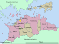
 -
 How the Scottish one look


Article(s): Various football articles, where teams from both England and Wales can compete.
Request: I would like some help to add the regions of England (shown here in a svg), to a similar style as the Scottish one shown above, that is, so it works with the {{ Location map}} template (which File:England and Wales.svg does right now), so it has to be a equirectangular projection of the regions, and I have yet to be able to find any. It would also be a plus for a separate image with all the British constituencies ( non equirectangular svg, I think, here) so it would be possible to create custom zoom ins like {{ Location map United Kingdom Greater London}} but over smaller or larger areas, [1] something like this (but equirectangular). chan dler ··· 23:27, 12 May 2009 (UTC)
Graphist opinion(s):
Article(s): Skanderbeg and more.
Request: Hello. I wish to ask if someone could create a map of Albania in the late Middle Ages. The map I have in mind is from Harry Hodgkinson's book, Scanderbeg: From Ottoman Captive to Albanian Hero which can be seen here [2]. The book is under copyright so I don't want to just copy it and put on Wikipedia (I did not make the copy in the link). If one is not able to read any of the labels, please refer back to me. Many thanks to anyone who is willing to take this up. Gaius Claudius Nero ( talk) 23:16, 21 May 2009 (UTC)
Graphist opinion(s):
-
 Azerbaijan administrative divisions

Article(s): Azerbaijan
Request: Can someone do this one please, similar to all the other location maps? Edit: Make it an svg
Graphist opinion(s):
- Do what with it? Zoo Fari 06:02, 30 May 2009 (UTC)
This was requested a couple of months ago, but got archived as "stale". I don't quite understand the logic of thinking that just because something hasn't been done immediately it shouldn't be done at all, but, anyway, I've now added coordinates to the article for all of the locations of these crosses, so it should be a doddle for any of our mapping experts to create a map. This needs a map of the south-eastern chunk of England between Lincoln and London marking the twelve locations whose coordinates are in the article. Phil Bridger ( talk) 17:34, 14 June 2009 (UTC)
- I've just spent several hours working out how to do this myself, as it seems that a simple request made in plain English gets ignored here. Could someone that knows how to do so please mark this as resolved? Phil Bridger ( talk) 11:37, 27 June 2009 (UTC)
-
 Italian
 -
 English translated by ZooFari


Article(s): Utazu, Kagawa
Request: English version, please and thanks... Chris (クリス • フィッチュ) ( talk) 09:11, 22 June 2009 (UTC)
Graphist opinion:
![]() Done How's that?
Zoo
Fari
15:14, 27 June 2009 (UTC)
Done How's that?
Zoo
Fari
15:14, 27 June 2009 (UTC)
-
 Original
 -
 New SVG


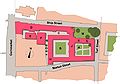
Article(s): Central Troy Historic District
Request: The article is currently going up for peer review and I'd like an upgraded version. Not sure if there are sources for a better background map, but it can use an upgrade; but if no source exists, I can deal. I'd like to see this vectorized and the red and green sections changed a bit. I'd like to see a border with low-opacity fill color for the respective colors. I believe low-opacity green on red shouldn't be a big issue. Thanks in advance! wadester 16 02:41, 8 June 2009 (UTC)
Graphist opinion(s):
![]() Request taken by ChrisDHDR.:
Request taken by ChrisDHDR.: it seems the background map is from Google (judging by the look 'n' feel, esp. the scale) - this is obviously copyright infringement and will need to be replaced by a copy from OpenStreetMap. sorry, false alert!
- I noticed on
Google Streetview that Ferry Street is partially a tunnel. Are there ant other such things?
Chris
DHDR
17:52, 16 June 2009 (UTC)
- No, that's the only tunnel. It was put there to allow for the construction and onramps of the bridge you see nearby. Let me know if you have other questions.
wadester
16
21:49, 17 June 2009 (UTC)
- I've uploaded the new SVG. I checked for errors but there might still be a few - tell me if you have ant corrections/suggestions. I just noticed that there's no scale or North arrow, I'll add one tomorrow.
Chris
DHDR
14:09, 18 June 2009 (UTC)
- Looks good. One small request: can you make sure that the Hudson River is labeled completely (with a capital R, also) and can you change its font to the same one as the street names? Not a fan of serif fonts for maps, really. Thanks again, looks great. wadester 16 17:35, 19 June 2009 (UTC)
- Not bad. I find the fill distracting, but that's just me. Can we maybe restore the highway shields, scale and north arrow? They give it more context and correspond to aspects of the accompanying text. Daniel Case ( talk) 17:55, 19 June 2009 (UTC)
- Also note that the small rectangle in the northeast corner should be separate, as it represents the former Grand Street Historic District. The accompanying text mentions five former districts; the map needs to reflect that.
Daniel Case (
talk)
17:58, 19 June 2009 (UTC)
- Yea, I was wondering about the 5th district. That makes sense. Here are the shields that are needed. Should be a quick add:
US 4 and
NY 2.
wadester
16
18:44, 19 June 2009 (UTC)
- On the source file, as well as viewing the SVG with Firefox "Hudson river" appears in the image - the problem must be MediaWiki PNG conversion software. How about making it "Hudson R." - that way it should fit in. The font is another MediaWiki problem - the source file uses
sans but MW doesn't seem to recognise it; I'll try to find a suitable font
here that will hopefully be recognised. I've added a North arrow and scale, the shields will come this weekend. Finally I'll corect the map's zones.
Chris
DHDR
19:32, 19 June 2009 (UTC)
- Hudson river should flow into the path...
Zoo
Fari
21:05, 19 June 2009 (UTC)
- Chris, under what file type did you save it in (e.g. Inkscape svg, svg, etc)? My Inkscape doesn't want to take it... Zoo Fari 21:13, 19 June 2009 (UTC)
- Hudson river should flow into the path...
Zoo
Fari
21:05, 19 June 2009 (UTC)
- On the source file, as well as viewing the SVG with Firefox "Hudson river" appears in the image - the problem must be MediaWiki PNG conversion software. How about making it "Hudson R." - that way it should fit in. The font is another MediaWiki problem - the source file uses
sans but MW doesn't seem to recognise it; I'll try to find a suitable font
here that will hopefully be recognised. I've added a North arrow and scale, the shields will come this weekend. Finally I'll corect the map's zones.
Chris
DHDR
19:32, 19 June 2009 (UTC)
- Yea, I was wondering about the 5th district. That makes sense. Here are the shields that are needed. Should be a quick add:
US 4 and
NY 2.
wadester
16
18:44, 19 June 2009 (UTC)
- I've uploaded the new SVG. I checked for errors but there might still be a few - tell me if you have ant corrections/suggestions. I just noticed that there's no scale or North arrow, I'll add one tomorrow.
Chris
DHDR
14:09, 18 June 2009 (UTC)
- No, that's the only tunnel. It was put there to allow for the construction and onramps of the bridge you see nearby. Let me know if you have other questions.
wadester
16
21:49, 17 June 2009 (UTC)
- I've added the shields, fixed a couple of street plan errors, and corrected the boundaries in a couple of places using
this source. However I'm not sure about the boundaries of the Grand Street historic District. I found a source
here however it's boundaries are in contradiction to everything else. Do you have something reliable? I made the file in Inkscape, so I can't understand why you can't open it. Do you have the latest version? The fonts are in Sans so I can't understand why MediaWikidoesn't recognise it (it claims it does). I tried to change all the text to DejaVu Sans however Inkscape crashes each time - very peculiar. I'll keep working on it.
Chris
DHDR
08:10, 20 June 2009 (UTC)
- I now seems that MW is putting the text as sans. Font problem fixed! Chris DHDR 09:04, 20 June 2009 (UTC)
- The source you found for Grant Street is unofficial and less reliable. The NRHP nom for Grant Street didn't include a map (I don't think; I'll check) but basically defined it as that block where I drew the small rectangle, which is actually where that aqua rectangle on the livingplaces.com map is centered.
Daniel Case (
talk)
16:51, 21 June 2009 (UTC)
- I was able to download, and made major cleanup to it (e.g. cut out shapes that aren't visible in the document). As for the Grant St.
Google Maps is considered a reliable source, especially the satellite images. Google obtains it's resources from
Tele Atlas, which is definitely a major source.
Zoo
Fari
17:56, 25 June 2009 (UTC)
- Right, but can you just dislocate the grand street square (in the top right corner) from the one below so they don't connect? That's the only remaining issue.
wadester
16
20:44, 25 June 2009 (UTC)
- Not really sure what street/block you are talking about (the one you want disconnected from Grant). Williams St? The green area?
Zoo
Fari
20:57, 25 June 2009 (UTC)
- Where two green areas at the corner of Union and Grand (not Grant) Streets in the top right corner. They connect, but they should not. All we need is for them to be separated.
wadester
16
21:14, 25 June 2009 (UTC)
- Like that? The borders are too thick compared to the small square. I resized it and moved it a little so I'm not sure if you'll like it... Zoo Fari 22:00, 25 June 2009 (UTC)
- Where two green areas at the corner of Union and Grand (not Grant) Streets in the top right corner. They connect, but they should not. All we need is for them to be separated.
wadester
16
21:14, 25 June 2009 (UTC)
- Not really sure what street/block you are talking about (the one you want disconnected from Grant). Williams St? The green area?
Zoo
Fari
20:57, 25 June 2009 (UTC)
- Right, but can you just dislocate the grand street square (in the top right corner) from the one below so they don't connect? That's the only remaining issue.
wadester
16
20:44, 25 June 2009 (UTC)
- I was able to download, and made major cleanup to it (e.g. cut out shapes that aren't visible in the document). As for the Grant St.
Google Maps is considered a reliable source, especially the satellite images. Google obtains it's resources from
Tele Atlas, which is definitely a major source.
Zoo
Fari
17:56, 25 June 2009 (UTC)
- So can we call this resolved?
Chris
DHDR
10:17, 27 June 2009 (UTC)
- Ok, marked as
 Done.
Chrisbot (
talk)
15:51, 28 June 2009 (UTC)
Done.
Chrisbot (
talk)
15:51, 28 June 2009 (UTC)
- Ok, marked as

Article(s): 2009 flu pandemic by country
Request: Change the colour for Malaysia, confirmed cases below 50, should be #ff6666 Arteyu ? Blame it on me ! 09:55, 19 June 2009 (UTC)
Graphist opinion(s):
![]() Done Colour changed.
Certes (
talk)
23:26, 28 June 2009 (UTC)
Done Colour changed.
Certes (
talk)
23:26, 28 June 2009 (UTC)

Article(s): Euro, Dollarization, Currency board, Petrodollar, World currency, United States dollar, International status and usage of the euro.
Request: This map has some errors on it I would like to see corrected. First of the map states that the Belarusian ruble is pegged to the U.S. Dollar, but it is also pegged to the Euro and Russian Ruble in a currency basket. I suggest making Belarus out of interchanging Purple/Olive lines.
Secondly the Moroccan dirham used by Morocco and the Western Sahara is pegged to the Euro. And the Jordanian dinar used by Jordan and the West Bank is pegged to the U.S. Dollar, this is also not shown. I request that these things be fix'd.-- SelfQ ( talk) 18:23, 20 June 2009 (UTC)
Graphist opinion(s):
![]() Done. You may need to add some notes to the articles listed above, to explain the Purple/Olive lines in
Belarus. I have left the rest of Palestine (
Gaza strip) grey.
Certes (
talk)
19:03, 29 June 2009 (UTC)
Done. You may need to add some notes to the articles listed above, to explain the Purple/Olive lines in
Belarus. I have left the rest of Palestine (
Gaza strip) grey.
Certes (
talk)
19:03, 29 June 2009 (UTC)
- Thanks for taking this up. Looks exactly how I wanted it, great!-- SelfQ ( talk) 08:50, 30 June 2009 (UTC)

Article(s): 2009 flu pandemic, etc
Request: Mark Guyana yellow please.-- SelfQ ( talk) 18:23, 20 June 2009 (UTC)
- And Tunisia, Hungary, Lithuania, Latvia and Montenegro red please.-- SelfQ ( talk) 15:21, 26 June 2009 (UTC)
Graphist opinion(s):
![]() Done The four European countries already appeared red (in RSVG) but had conflicting attributes; they're now consistently red.
Certes (
talk)
17:58, 29 June 2009 (UTC)
Done The four European countries already appeared red (in RSVG) but had conflicting attributes; they're now consistently red.
Certes (
talk)
17:58, 29 June 2009 (UTC)
- Great, Thank you.-- SelfQ ( talk) 08:41, 30 June 2009 (UTC)
Article(s): Buildings of Jesus College, Oxford
Request: Would someone be so kind as to knock up a little sketch-map of Jesus College, Oxford for me? Doesn't have to be anything too spectacular, just something that shows roughly what's where (3 quadrangles, hall, chapel, principal's lodgings, that sort of thing) and what the streets nearby are called. The following might be helpful:
- A long-shot map from the college website (buildings in red on the island site surrounded by Ship St, Turl St, Market St and Cornmarket
- A simple illustration
- A more detailed plan from the college website (pdf) (wouldn't need all that detail of what rooms are where).
Thanks, Bencherlite Talk 16:40, 1 July 2009 (UTC)
Graphist opinion(s):
![]() Request taken by Joopercoopers. - might need someone to inkscape it into a svg for me again when I'm done. --
Joopercoopers (
talk)
12:16, 3 July 2009 (UTC)
Request taken by Joopercoopers. - might need someone to inkscape it into a svg for me again when I'm done. --
Joopercoopers (
talk)
12:16, 3 July 2009 (UTC)
- You could start by tracing the building into OpenStreetMap
here (using OSM editor software and Yahoo aerial imagery) then export that to SVG. OpenStreetMap already has a lot of building detail in Oxford, but not the individual buildings of this college --
Harry Wood (
talk)
13:45, 6 July 2009 (UTC)
- Bench - not forgotten, but I'm going to struggle to complete this today - you might have to wait a few more. --
Joopercoopers (
talk)
16:38, 6 July 2009 (UTC)
- No rush; I won't be going to FAC with the article for a few weeks anyway. Bencherlite Talk 21:13, 7 July 2009 (UTC)
- Bench - not forgotten, but I'm going to struggle to complete this today - you might have to wait a few more. --
Joopercoopers (
talk)
16:38, 6 July 2009 (UTC)
-
 A= First Quad, B=Second Quad, C=Third Quad, D=Junior Common Room, E=Habakkuk Room, F=Dining Hall, G=Chapel

Please let me know if you need any alterations - different colours, letters etc. -- Joopercoopers ( talk) 17:05, 19 July 2009 (UTC)
-
 Metro Subway map
 -
 Light Rail and Metro Subway diagram
 -
 Light Rail diagram


)
.svg)
![[1]](http://imgur.com/Jt5.png)
![[2]](http://i4.photobucket.com/albums/y107/XpoFERENS/hhsM.jpg)
Article(s): Baltimore Light Rail, Metro Subway (?)
Request: I would like to see a map of the Baltimore light rail system which might look like this map. The most important part is the existing lines but if you want to do another one with planned likes that would be fine.
It could also be interesting to use the Metro Subway map above to do a combination map SVG of the type of the File:Tramway Bordeaux.svg. Or a map that does a more realistic view of the city. Either way, I think the article needs a map and anything you can come up with from the sources would be great. gren グレン 09:35, 15 July 2009 (UTC)
Graphist opinion(s): How about something like File:BaltimoreLightRail.svg, loosely based on the London Underground's Tube map? Certes ( talk) 18:44, 23 July 2009 (UTC)
- I think that's quite good and usable. I think at some point it it might be useful to do a semi-geographically accurate map but it's not necessary and what you made is far easier to read than the "route map" from the infobox. One small request, could you do a light rail only version? If not I can probably wrangle with the SVG and remove the Metro line. I'm not sure which is better for the article but it seems wise to have both versions. Thank you :) --
gren
グレン
08:52, 24 July 2009 (UTC)
- I've added
File:BaltimoreLightRailOnly.svg without the Metro Subway. The SVG is a plain and simple one, so anyone can do further edits in
Inkscape or a text editor if you wish.
Certes (
talk)
09:52, 24 July 2009 (UTC)
- Thank you very much, they look quite good and will improve the articles. gren グレン 05:46, 27 July 2009 (UTC)
- I've added
File:BaltimoreLightRailOnly.svg without the Metro Subway. The SVG is a plain and simple one, so anyone can do further edits in
Inkscape or a text editor if you wish.
Certes (
talk)
09:52, 24 July 2009 (UTC)