
 | This page, part of the
Graphics Lab Wikiproject, is an
archive of requests for May 2010. Please do not edit the contents of this page. You can submit new requests here. |
Stale Information
Thermosiphon
-
 regular water heating system
 -
regular water heating system SVG (Done)
-
 solar water heating system
 -
 solar water heating system 2


Article(s): Thermosiphon
Request: Images need SVG'ing KVDP ( talk) 14:03, 3 April 2010 (UTC)
Graphist opinion(s):
![]() Request taken by Mononomic.. I'll begin with the first one (Thermosiphon water heating system). —
Mono·
nomic 22:32, 3 April 2010 (UTC)
Request taken by Mononomic.. I'll begin with the first one (Thermosiphon water heating system). —
Mono·
nomic 22:32, 3 April 2010 (UTC)
 Done and uploaded as
File:Thermosiphon water heating system.SVG. —
Mono·
nomic 00:42, 4 April 2010 (UTC)
Done and uploaded as
File:Thermosiphon water heating system.SVG. —
Mono·
nomic 00:42, 4 April 2010 (UTC)
I'm not sure the other two are entirely necessary. Isn't there a picture on the Thermosiphon page that does the job just as well? — Mono· nomic 02:18, 5 April 2010 (UTC)
- No, not really. Most of the images are self-adapted to demonstrate other specifics. If you look closely to the other images, you'll see that they contain some specifics that aren't present in the other images.
KVDP ( talk) 11:17, 9 April 2010 (UTC)
Windmill ship
Article(s): Windmill ship
Request: Image needs SVG'ing KVDP ( talk) 11:25, 9 April 2010 (UTC)
Graphist opinion(s):
214th Reconnaissance Squadron emblem
Article(s): 214th Reconnaissance Squadron
Request: Could someone please create the emblem of the unit. Thanks. Kevin Rutherford ( talk) 20:01, 10 April 2010 (UTC)
Graphist opinion(s):
Coat of Arms of Vigdís Finnbogadóttir

Article(s): Vigdís Finnbogadóttir
Request: Vectorize. Connormah ( talk | contribs) 04:55, 11 April 2010 (UTC)
Graphist opinion(s):
Italian Social Republic


Article(s): Italian Social Republic
Request: using the flag, replace the coat of arms dragon-buzzard-griffin with the eagle... Chris (クリス • フィッチュ) ( talk) 15:42, 4 April 2010 (UTC)
Graphist opinion(s):Although I've swapped the eagle over for some reason the strokes/feathers are not displaying. They are in Illustrator and they are present in the SVG but I have no idea why they aren't displaying. Me and flags just don't seem to get on! --
Fred the Oyster (
talk) 13:34, 6 April 2010 (UTC)
![]() Request taken by Fred the Oyster.
Request taken by Fred the Oyster.![]() Done
Done
- That is weird. Much better, thank you! Anyone have an idea about the disappearing black detailing? --
Chris (クリス • フィッチュ) (
talk) 17:29, 6 April 2010 (UTC)
- While we're at it, the fasces should be centered top-to-bottom, and the border should be solid, not beveled. --
Chris (クリス • フィッチュ) (
talk) 09:07, 11 April 2010 (UTC)
- Doesn't matter now as the original uploader has reverted back to his own, original version. -- Fred the Oyster ( talk) 22:14, 11 April 2010 (UTC)
- While we're at it, the fasces should be centered top-to-bottom, and the border should be solid, not beveled. --
Chris (クリス • フィッチュ) (
talk) 09:07, 11 April 2010 (UTC)
- Then can you reupload your corrected version as File:Coat of arms of the Italian Social Republic.svg, and work from that corrected version? -- Chris (クリス • フィッチュ) ( talk) 04:54, 12 April 2010 (UTC)
Irish Girl Guides

Article(s): Irish Girl Guides
Request: emblem changed today, new version with permission at http://www.irishgirlguides.ie/index.cfm?fa=contentGeneric.wnjgoqelctakyyid&pageId=230916 ... Chris (クリス • フィッチュ) ( talk) 05:12, 12 April 2010 (UTC)
Graphist opinion(s):
Wind turbine images
-
 1st image
 -
 2nd image


Article(s): Wind turbine
Request: The EERE_Illust_large_image needs to be imbedded into the HAWT turbine components image; the image I draw would thus be the larger whole, and the EERE image would function as a magnification of the head of the turbine (as it contains more info). The image I made would provide more info as it mentions the nacelle, rotor blades, rotor hub and transformer08:57, 30 March 2010 (UTC)
Graphist opinion(s): This is going to be a fiddly bugger so will take quite a while. I'm too busy to spend all my time on, so will only be able to bits at a time when I have a few minutes. -- Fred the Oyster ( talk) 13:36, 6 April 2010 (UTC)
- Take your time, there's no rush.
KVDP (
talk) 07:37, 12 April 2010 (UTC)
![]() Request taken by Fred the Oyster.
Request taken by Fred the Oyster.
Propeller walk
.JPG)
Article(s): Propeller walk
Request: Image needs SVG'ing, perhaps rename as "Propeller_walk_with_single_propeller(s)" KVDP ( talk) 12:11, 30 March 2010 (UTC)
Graphist opinion(s):Is all the text strictly necessary as that could be written both in the image's description and in the article that uses the illustration ? -- Fred the Oyster ( talk) 11:23, 9 April 2010 (UTC)
- No I guess it can also be written in the description. I normally write the text at the image so as to be sure the text is kept. However, if you simply refer to my image via a link the text is also certain to be kept, so this image can have the text added in the description.
KVDP ( talk) 07:36, 12 April 2010 (UTC)
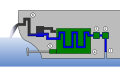
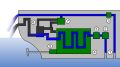
Geothermal_heat_pump
-

-
 Done
Done


Article(s): Geothermal_heat_pump
Request: Image needs SVG'ing KVDP ( talk) 12:12, 30 March 2010 (UTC)
- Thanks Fred, there are some small incorrections dough --> first of all there is an arrow missing at cold storage (1st image). Next, I would change the aquifer color to something in between blue and brown (ground). Aquifer layers are just a layer with water + ground, so having the layer shown as water is not accurate, and it may be not completely clear to distinguish the difference between the "cold storage" and the aquifer. I hope you can upload a new version with the updates.
KVDP ( talk) 13:43, 3 April 2010 (UTC)
- There you go. I have no idea why the arrow disappeared, it was there in the original Illustrator file. all sorted now though, and I used a gradient for the aquifer layer. It goes from the brown I used for the soil to the blue I used for the water. I hope that's okay for you? --
Fred the Oyster (
talk) 14:16, 3 April 2010 (UTC)
- More than fine Fred. Thanks
- There you go. I have no idea why the arrow disappeared, it was there in the original Illustrator file. all sorted now though, and I used a gradient for the aquifer layer. It goes from the brown I used for the soil to the blue I used for the water. I hope that's okay for you? --
Fred the Oyster (
talk) 14:16, 3 April 2010 (UTC)
KVDP ( talk) 11:06, 9 April 2010 (UTC)
- What is the thing at the top of the diagram supposed to be? It really isn't clear. Kaldari ( talk) 17:17, 15 April 2010 (UTC)
Graphist opinion(s):
![]() Request taken by Fred the Oyster.
Request taken by Fred the Oyster.![]() Done
Done
Types of bird feet
-

-
 SVG
SVG


Article(s): Bird anatomy and Dactyly
Request: Please redraw as an SVG, cheers. Fallschirmjäger 18:41, 13 April 2010 (UTC)
Graphist opinion(s):
![]() Request taken by Andrew c.: -
Andrew c
[talk] 14:07, 16 April 2010 (UTC)
Request taken by Andrew c.: -
Andrew c
[talk] 14:07, 16 April 2010 (UTC)
- Looks like someone didn't mark taken.... File:Bird-feets.svg. I was doing research as well... [1] - Andrew c [talk] 14:15, 16 April 2010 (UTC)
- It seems like the di- and tri- configurations are more rare, and that syndactyl, pamprodactyl and zygodactyl should perhaps be included. I also think the length of the segments is a bit confusing, and it doesn't make sense to me that the number of segments should correspond to the digit number.... but look at me trying to improve on a simple conversion :) - Andrew c [talk] 14:21, 16 April 2010 (UTC)
- Cheers for looking into it though, I appreciate it! I agree that the number of segments is confusing but also second your idea that it would be useful to include those 3 other types.
Fallschirmjäger
✉ 15:15, 16 April 2010 (UTC)
- Just found a good link that has plenty more types too if anyone is willing to add them to the SVG Fred kindly made. Fallschirmjäger ✉ 15:21, 16 April 2010 (UTC)
- Cheers for looking into it though, I appreciate it! I agree that the number of segments is confusing but also second your idea that it would be useful to include those 3 other types.
Fallschirmjäger
✉ 15:15, 16 April 2010 (UTC)
Dolphin anus
![]() Done
Done

Article(s): Melon (whale)
Request: Move label 'anus' to correct position; it currently points at the rectum.
Graphist opinion(s): Where exactly is the correct position? Is it where the rectum meets the outside? Kaldari ( talk) 20:04, 14 April 2010 (UTC)
ReedBedSetUps.jpg
-
 Reedbeds image

Article(s): Treatment pond
Request: Image needs to be svg'ed and colored. KVDP ( talk) 17:06, 21 April 2010 (UTC)
Graphist opinion(s):
- I'm concerned about the copyright status, so I'm contacting Dion van Oirschot on Facebook for his POV. Maybe he can supply originals that can be reworked somewhat. -- Slashme ( talk) 08:50, 8 May 2010 (UTC)
Operation_of_Regenerative_economy.JPG

Article(s): Cradle_to_Cradle_Design
Request: Image needs SVG'ing KVDP ( talk) 07:17, 24 April 2010 (UTC)
Graphist opinion(s):
Coat of arms of the Congo Free State


Article(s): Congo Free State
Request: svgify, or cleanup existing svg... Chris (クリス • フィッチュ) ( talk) 14:30, 24 April 2010 (UTC)
Graphist opinion(s):
Shimer College Seal

Article(s): Shimer College
Request: Sharpen and vectorize, please? This is from a B&W scan. The actual seal is maroon, like file:Shimer College Logo.PNG. Can the color be changed, as well? Thanks. Nasty Housecat ( talk) 04:20, 26 April 2010 (UTC)
Graphist opinion(s):
- This image is too poor in quality to figure out what all the detail are supposed to be depicting. We need to find a better source. I was unable to find the seal anywhere on their official website. Are you sure it is still used? I was able to locate various PDFs that had the Shimer logo in vector format which could be extracted and saved as an SVG... but that isn't exactly what you were asking. - Andrew c [talk] 19:42, 11 May 2010 (UTC)
- Nor was I, so I asked them again, and they finally scrounged up a TIFF version without the motto, but it should work. Thanks for looking into it. -- Nasty Housecat ( talk) 22:27, 11 May 2010 (UTC)
Imam al-Mahdi Scouts

Article(s): Imam al-Mahdi Scouts
Request: remove blue background... Chris (クリス • フィッチュ) ( talk) 08:04, 12 April 2010 (UTC)
Graphist opinion(s): {{Done}} - Request completed by
Gadget850.
Fallschirmjäger 14:33, 13 April 2010 (UTC)
:Not done, image should be split, not replaced. --
Chris (クリス • フィッチュ) (
talk) 03:45, 14 April 2010 (UTC)
- I propose that this should be made into two separate images, as they are significantly different one from the other, to show historical progression. I propose the name File:Imam al-Mahdi Scouts 2010.png for the new one. -- Chris (クリス • フィッチュ) ( talk) 03:11, 15 April 2010 (UTC)
- Now that version is restored, restating request. -- Chris (クリス • フィッチュ) ( talk) 02:21, 30 April 2010 (UTC)
Flag of Haiti
-
 Flag of Haiti
.svg)
Article(s): Empire of Haiti
Request: Convert into SVG format please thanks Mackay 86 ( talk) 10:20, 30 April 2010 (UTC)
Graphist opinion(s):
Tannu Tuva
.svg)
Article(s): Tannu Tuva
Request: svgify... Chris (クリス • フィッチュ) ( talk) 18:08, 30 April 2010 (UTC)
Graphist opinion(s):
Coat of arms of Haiti & Imperial Standard of the Tsar
-
 Coat of arms of Haiti
 -
 Imperial Standard of the Tsar
 -
 added by Fry1989
.png)
.png)

Article(s): Empire of Haiti, Tsardom of Russia
Request: Add new colours & convert into SVG if possible, or recreate images from scratch please thanks Mackay 86 ( talk) 10:05, 30 April 2010 (UTC)
- Fry1989, the two Imperial Standards are actually complete different. The one on the left is the standard of the Russian Tsar whereas the one on the left is of the Russian Emperor. Note that Tsar & Emperor were separate titles in Russia and were not the same. Mackay 86 ( talk) 21:56, 1 May 2010 (UTC)
- Actually Tsar was synonymous with Emperor in Russian, so you are incorrect on that, as while the Tsardom and Russian Empire were two seperate entities, they both shared the title of Tsar. I am aware that they are different designs, however the one I added, is from what I have seen more accurate to the one used by Tsar Nicholas II. Preferably, BOTH should be made into SVG format, as they were both used at one time. Fry1989 ( talk) 19:30, 2 May 2010 (UTC)
- What i meant to say was that the title "Tsar" or "Czar" is the Slavic form of the Roman title of Caesar whereas the title of Emperor is derived from the Roman title of "Imperator" so technically they are different. Moreover, in Russian Tsar is spelled "Царь" and Emperor is spelled "Император". Therefore, they are not completely synonymous. In addition, Peter I changed the title from Tsar to Imperator (Emperor) in 1721 with the proclamation of the Russian Empire. Nevertheless, the title of Tsar remained in common usage until 1917. Mackay 86 ( talk) 20:53, 2 May 2010 (UTC)
Graphist opinion(s):
Flag of the Holy Roman Empire & Coat of arms
-
 Flag of the Holy Roman Empire
 -
Coat of arms

Article(s): Holy Roman Empire
Request: Convert into SVG format with a higher resolution (ie 800x500px) please thanks.
Mackay 86 (
talk) 14:13, 30 April 2010 (UTC)
Also could convert the Coat of arms into SVG format with new colours as well thanks.
Mackay 86 (
talk) 20:54, 2 May 2010 (UTC)
Graphist opinion(s):
Tasmanian rainfall
Article(s): Climate_of_Australia#Tasmania
Request: Needs vectorization Frt975 ( talk) 22:03, 6 May 2010 (UTC)
Graphist opinion(s):
- I'd note that I nominated the image for deletion due to verifiability concerns. ( link to nomination) — Quibik ( talk) 00:00, 7 May 2010 (UTC)
Coat of arms of Central Africa
-
Coat of arms
-
 perhaps this base will help

Article(s): Central African Empire
Request: Convert into SVG and new colours Mackay 86 ( talk) 01:28, 7 May 2010 (UTC)
Graphist opinion(s):
Macedonian Orthodox Church - Coat of Arms

Article(s): Macedonian Orthodox Church
Request: Please remove white background, thanks. Bakersdozen77 ( talk) 21:00, 22 April 2010 (UTC)
- And trim down a little, please. -- Chris (クリス • フィッチュ) ( talk) 12:55, 24 April 2010 (UTC)
Graphist opinion(s):
Someone fixed this and forgot to post here! Anyway, it seems to be done. --
Slashme (
talk) 09:03, 8 May 2010 (UTC)
![]() Done
Done
Socialist Federal Republic of Yugoslavia

.svg)
Article(s): Socialist Federal Republic of Yugoslavia
Request: svgify this older variant... Chris (クリス • フィッチュ) ( talk) 16:59, 24 April 2010 (UTC)
Graphist opinion(s): What exactly are the differences? If it's something simple, then I'll whip it up today. NikNaks93 ( talk) 17:20, 6 May 2010 (UTC)
- There are five torches and flames rather than the later six. Thanks! -- Chris (クリス • フィッチュ) ( talk) 18:06, 6 May 2010 (UTC)
- Beautiful, and very close, thank you! The wheat sheaving should be continuous at the bottom. -- Chris (クリス • フィッチュ) ( talk) 15:30, 8 May 2010 (UTC)
SS Music logo

Article(s): SS Music
Request: SVGify, please. Source, full resolution. — ξ xplicit 02:02, 1 May 2010 (UTC)
Graphist opinion(s): I did search their website for PDF sources but that yielded nothing! That means this logo will have to redrawn...but that wont be easy, since it involves a lot of gradients and any attempt to vectorize this logo will attract criticism since it is a non-free image. There have been past incidents where graphists were criticized because of this issue! -- JovianEye ( talk) 02:42, 1 May 2010 (UTC)
- It's rare for me to make this comment, but I don't think it would be worthwhile to make this an SVG: There's no chance to improve the logo in the future by modifying the file, because it's a logo. The text can't remain text, because we don't have the fonts for it, so the searchability advantage isn't there. An SVG wouldn't be conceptually simpler (for example with a line drawing) because it's full of gradients and light effects. The current picture does the job very well, so leave it alone. -- Slashme ( talk) 12:35, 8 May 2010 (UTC)
Resolved Information
Fujiwara
Article(s): Fujiwara
Request: svgify... Chris (クリス • フィッチュ) ( talk) 18:54, 22 April 2010 (UTC)
Graphist opinion(s):
![]() Request taken by Cybercobra.
Request taken by Cybercobra.
Countersuggestion: Don't use images at all: (I'm sure I've misread the original chart somehow; tell me what's wrong and I'll fix it)
| Hidesato | |||||||||||||||||||||||||||||||||||||||||||||||||||||||||||||||||||||||||||||||||||||||||||||||||||||||||||||
| Yoshifusa-Mototsune | Yoshisuke | Yoshikado (Kwanjuji) | Murao | ||||||||||||||||||||||||||||||||||||||||||||||||||||||||||||||||||||||||||||||||||||||||||||||||||||||||||
| Fuyutsugu | Toyozawa | Nakanari | |||||||||||||||||||||||||||||||||||||||||||||||||||||||||||||||||||||||||||||||||||||||||||||||||||||||||||
| Tsuginawa | Asakari | Uchimaro | Fujinari | Sonondo | Tanetsugu | Otsugu | |||||||||||||||||||||||||||||||||||||||||||||||||||||||||||||||||||||||||||||||||||||||||||||||||||||||
| Toyonari | Nakamaro | Nagate | Kiyokawa | Matate | Uona | Kaedemaro | Hirotsugu | Kiyonari | Yoshitsugu | Momokawa | Kurajimaro | Hamanari | |||||||||||||||||||||||||||||||||||||||||||||||||||||||||||||||||||||||||||||||||||||||||||||||||
| Muchimaro | Fusasaki | Umakai | Maro | ||||||||||||||||||||||||||||||||||||||||||||||||||||||||||||||||||||||||||||||||||||||||||||||||||||||||||
| Kamatari-Fuhito | |||||||||||||||||||||||||||||||||||||||||||||||||||||||||||||||||||||||||||||||||||||||||||||||||||||||||||||
![]() Done--
Cybercobra
(talk) 04:25, 24 April 2010 (UTC)
Done--
Cybercobra
(talk) 04:25, 24 April 2010 (UTC)
- That is fantastic, thank you! I will check it later, but you rock! -- Chris (クリス • フィッチュ) ( talk) 12:57, 24 April 2010 (UTC)
Internal combustion engine cooling
-
 fully closed IC engine cooling system
 -
 Open IC engine cooling system
 -
 Open IC engine cooling system with thermal energy recovery
 -
 Semiclosed IC engine cooling system

.JPG)

.JPG)
-
 Done
Done -
 Done
Done -
 Done
Done -
 Done
Done

.svg)
.svg)
.svg)
Article(s): Internal combustion engine cooling
Request: Images need SVG'ing KVDP ( talk) 11:35, 9 April 2010 (UTC)
Graphist opinion(s):
![]() Request taken by Dahnielson.
Request taken by Dahnielson.
![]() Request taken by Lokal_Profil. (since quite some time had passed since the above "taken")
Request taken by Lokal_Profil. (since quite some time had passed since the above "taken")
- Feel free to suggest improvements (especially colour wise). / Lokal _ Profil 22:59, 28 April 2010 (UTC)
Hideki Tojo

Article(s): Hideki Tojo
Request: svgify... Chris (クリス • フィッチュ) ( talk) 10:06, 12 April 2010 (UTC)
Graphist opinion(s):
![]() Request taken by Shandris.
Request taken by Shandris.
- Any luck? -- Chris (クリス • フィッチュ) ( talk) 02:45, 30 April 2010 (UTC)
US Army military operations diagram
-
 scanned diagram of US Army operation
 -
 Svg version.


Article(s): United States Army
Request: This should be a straightforward image to vectorize, which is right now a bit of an eyesore in a quite visible article. I'd do this myself, but I'm busy with other image-related work at the moment. Perhaps someone else is willing? — Quibik ( talk) 21:06, 15 April 2010 (UTC)
Graphist opinion(s):Fred did it. NativeForeigner Talk/ Contribs 00:30, 27 April 2010 (UTC)
- Great! Many thanks to Fred and to you as well, NativeForeigner, for letting me know! — Quibik ( talk) 16:26, 29 April 2010 (UTC)
Mohan Meakin Brewery

Article(s): Mohan Meakin Brewery
Request: trim blank space... Chris (クリス • フィッチュ) ( talk) 05:27, 30 April 2010 (UTC)
Graphist opinion(s):
![]() Request taken by Jovianeye.
Request taken by Jovianeye. ![]() Done
Done
- Perfect, thank you! -- Chris (クリス • フィッチュ) ( talk) 06:11, 30 April 2010 (UTC)
South African Scout Association
Article(s): South African Scout Association
Request: remove shadowing... Chris (クリス • フィッチュ) ( talk) 18:39, 13 April 2010 (UTC)
Graphist opinion(s): I'd vectorize this, but the licensing is a bit unclear – do you claim to be the copyright owner? Are you thus the original author of the unofficial logo? — Quibik ( talk) 22:06, 19 April 2010 (UTC)
- No, I got an e-mail from the image's author, who is a Wikipedian but wants to remain anonymous, for reasons of identity in South Africa. Not sure I get it but I will abide by it. So I changed the licensing to the best one I knew. Unless there's a better one... -- Chris (クリス • フィッチュ) ( talk) 04:04, 20 April 2010 (UTC)
- Splendid, thank you so much! -- Chris (クリス • フィッチュ) ( talk) 03:45, 1 May 2010 (UTC)
split
-
 the one with the normal looking eagle, please save as File:Coat of Arms of the Italian Social Republic.svg
Request: split into two separate images each-both images contain two distinct images, which should not overwrite each other... Chris (クリス • フィッチュ) ( talk) 08:01, 29 April 2010 (UTC)
Graphist opinion(s):

![]() Done You could have done this yourself, this involves absolutely no image editing. I refuse to make an editorial decision, so the 1st image is at
File:Coat of Arms of the Italian Social Republic.svg --
Cybercobra
(talk) 08:25, 29 April 2010 (UTC)
Done You could have done this yourself, this involves absolutely no image editing. I refuse to make an editorial decision, so the 1st image is at
File:Coat of Arms of the Italian Social Republic.svg --
Cybercobra
(talk) 08:25, 29 April 2010 (UTC)
- Actually I could not have, my computer does not accept svg's. Anything I can do for myself, I would not ask others to do. --
Chris (クリス • フィッチュ) (
talk) 02:14, 30 April 2010 (UTC)
- Even if you don't have to software to open them, your computer can still download and upload the files. In any case, glad I was able to help. -- Cybercobra (talk) 03:01, 1 May 2010 (UTC)
Naropa University
Article(s): Naropa University
Request: transparent background... Chris (クリス • フィッチュ) ( talk) 19:20, 30 April 2010 (UTC)
Graphist opinion(s):
- Done. —
Quibik (
talk) 23:51, 30 April 2010 (UTC)
- Great, thank you! -- Chris (クリス • フィッチュ) ( talk) 03:48, 1 May 2010 (UTC)
Shanghai World Expo


Article(s): Shanghai World Expo
Request: trim away extra blank space, svgify... Chris (クリス • フィッチュ) ( talk) 13:47, 3 May 2010 (UTC)
Graphist opinion(s): ![]() Done--
Svgalbertian (
talk) 14:16, 3 May 2010 (UTC)
Done--
Svgalbertian (
talk) 14:16, 3 May 2010 (UTC)
- That was fast, thanks! -- Chris (クリス • フィッチュ) ( talk) 14:24, 3 May 2010 (UTC)
Close relationships
-
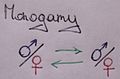 Monogamy
 -
 Done
Done -
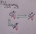 Polygamy
 -
 Done
Done -
 Group marriage
 -
 Done
Done


Article(s): Monogamy; Polygamy, Group marriage
Request: Images need SVG'ing. Also, the male/female colors can be changed to medium blue and pink KVDP ( talk) 13:59, 3 April 2010 (UTC)
Graphist opinion(s):
![]() Request taken by Shandris.
Request taken by Shandris.
- It's better if the text isn't included in the picture. That way the images can be used on other languaged wikipedias as well. The text can always be included from the caption instead. /
Lokal
_
Profil 15:24, 14 April 2010 (UTC)
- Are these ok? Got a version of Monogamy with standardised venus/mars symbols and no text as well if required. /
Lokal
_
Profil 00:32, 28 April 2010 (UTC)
- Yeah, change the monogamy picture to a picture without text, this way it's more coherent to the other pictures. As for the text itself, this needs to be inputted to the image description; add a "english"-line, so that translation in other languages too can occur. Also, in the image description of the polygamy and group marriage, it's best to mention that the arrows between the symbols only connect 1 of both, so 1 male symbol and 1 female symbol, ... not both the male/female + male+female; this is not totally clear, atleast not when looking at 1 image separately, ie on a article. Already added images to articles.
- Are these ok? Got a version of Monogamy with standardised venus/mars symbols and no text as well if required. /
Lokal
_
Profil 00:32, 28 April 2010 (UTC)
KVDP ( talk) 17:06, 28 April 2010 (UTC)
Mediation Cabal ad
Fred the Oyster is now indefinitely blocked as a sockpuppet of a banned user; can someone else finish this request please? It needn't look exactly the same as the first draft - just the basic elements need to be there. Thanks. Rd232 talk 09:26, 14 April 2010 (UTC)
-
 Mediation Cabal logo
 -
 Cabal Approved stamp


Article(s): WP:MEDCAB
Request: Please create a WP:BANNER for the Mediation Cabal, asking for volunteers to be mediators. See the existing examples of internal "Wikipedia Ads" at WP:BANNER and the front page of WP:MEDCAB. The ad could be animated but probably better not. Thanks! Rd232 talk 20:45, 6 April 2010 (UTC)
Graphist opinion(s):
- What text do you want the banner to say? --
Fred the Oyster (
talk) 18:26, 7 April 2010 (UTC)
- Ah, good point. I think the main text could be "The Mediation Cabal is a bunch of volunteers providing unofficial, informal mediation for disputes on Wikipedia. Why not help out?", and the shortcut WP:MEDCAB could be displayed somewhere as well, near the Cabal Approved logo. That would be enough, but an animated version where the text is initially
"If you can keep your head when all about you
Are losing theirs..."
- Rudyard Kipling, If-
and then fades into the text above would be cute.
Rd232
talk 19:21, 7 April 2010 (UTC)
- OK, that's a good start, but some tweaking please. 1. Take away the "Cabal Approved" stamp and have it appear on the right-hand side, above a "WP:MEDCAB" shortcut notice. Or leave out the shortcut if space is an issue, but at any rate have the stamp on the right hand side, not looking like it's in any way part of the logo. Or even drop the stamp altogether, especially if space is an issue, which it probably is. 2. Keep the fancy font just for the quote part of the text; make everything else (including the Kiping/If bit) an easy-to-read sans serif font. Then it should be good to go. Thanks!
Rd232
talk 20:44, 11 April 2010 (UTC)
- It seems FtO has uploaded a new version of the banner.
Fallschirmjäger
✉ 14:52, 17 April 2010 (UTC)
- Instead of sliding the cabal stamp into the graphic, why not just stamp it (as would presumably be expected). Sliding the MEDCAB logo across the graphic is also unnecessary (and a bit tedious in my opinion). Why not just leave the MEDCAB logo on the left side, slide down the MEDCAB title, and then stamp the cabal approved stamp on the right side? That would make more sense to me at least. Kaldari ( talk) 15:15, 23 April 2010 (UTC)
- It seems FtO has uploaded a new version of the banner.
Fallschirmjäger
✉ 14:52, 17 April 2010 (UTC)
Simele Massacre
Article(s): Simele Massacre
Request: trim away blank space... Chris (クリス • フィッチュ) ( talk) 06:39, 4 May 2010 (UTC)
Graphist opinion(s):
![]() Request taken by Jovianeye.
Request taken by Jovianeye.![]() Done See if it's ok! --
JovianEye (
talk) 19:10, 5 May 2010 (UTC)
Done See if it's ok! --
JovianEye (
talk) 19:10, 5 May 2010 (UTC)
- It's great, thank you! -- Chris (クリス • フィッチュ) ( talk) 02:00, 6 May 2010 (UTC)
United Continental merger logo
Article(s): United Airlines, Continental Airlines
Request: Create a vector version of this logo. It uses the same font as the original Continental Logo. Plau ( talk) 10:31, 5 May 2010 (UTC)
Graphist opinion(s):
![]() Request taken by Jovianeye.
Request taken by Jovianeye. ![]() Done I have extracted the logo from an official PDF source! --
JovianEye (
talk) 03:48, 6 May 2010 (UTC)
Done I have extracted the logo from an official PDF source! --
JovianEye (
talk) 03:48, 6 May 2010 (UTC)
Roadrunner Records logo
-
The logo for Roadrunner Records
-
 SVG version
Article(s):
Roadrunner Records
Request: Please convert to SVG.-- Rockfang ( talk) 01:27, 3 May 2010 (UTC)
Graphist opinion(s):
![]() Request taken by Jovianeye.
Request taken by Jovianeye.![]() Done File has been uploaded to commons. --
JovianEye (
talk) 05:29, 3 May 2010 (UTC)
Done File has been uploaded to commons. --
JovianEye (
talk) 05:29, 3 May 2010 (UTC)
- I'm seeing drastically different colors between the SVG (and its auto-generated PNG) and the original.png. 64.242.195.17 ( talk) 17:48, 5 May 2010 (UTC)
Bridgestone Arena
Article(s): Bridgestone Arena
Request: remove background, svgify... Chris (クリス • フィッチュ) ( talk) 15:12, 4 May 2010 (UTC)
Graphist opinion(s):
![]() Request taken by Jovianeye.
Request taken by Jovianeye. ![]() Done
Done
- Outstanding, really splendid, thank you! -- Chris (クリス • フィッチュ) ( talk) 03:27, 7 May 2010 (UTC)
State organs of the People's Republic of China
-
SVG. Note: The file is currently at Gov2.svg - I've asked for a rename.
Article(s): People's Republic of China, National People's Congress, President of the People's Republic of China, Government of the People's Republic of China
Request: Vectorize. It's insane that this is a jpeg. Cybercobra (talk) 08:17, 23 April 2010 (UTC)
Graphist opinion(s):
![]() Done --
Slashme (
talk) 09:56, 8 May 2010 (UTC)
Done --
Slashme (
talk) 09:56, 8 May 2010 (UTC)
- Awesome, thanks! -- Cybercobra (talk) 10:30, 8 May 2010 (UTC)
V-Model
-
 Development process chart
 -
 SVG version


Article(s): V-Model, V-Model (software development), System requirements (spacecraft system)
Request: Create vector version (Does not need to copy the exact same look). Cybercobra (talk) 02:10, 24 April 2010 (UTC)
Graphist opinion(s):
![]() Done --
Slashme (
talk) 10:51, 8 May 2010 (UTC)
Done --
Slashme (
talk) 10:51, 8 May 2010 (UTC)
- Great, but could you add just a bit of empty space at the bottom below the text? It currently looks like it was over-cropped. -- Cybercobra (talk) 11:16, 8 May 2010 (UTC)
Aegeria
-
 "Egeria was a water nymph in Roman mythology. She was most famously the second wife and counselor of the second king of Rome, Numa Pompilius."
 -
 PNG version


Article(s): Book:Trust law in wealth management and estate planning
Request: Clean-up, remove artifacts, etc... Headbomb { talk / contribs / physics / books} 10:59, 3 May 2010 (UTC)
Graphist opinion(s):
![]() Request taken by slashme.
Request taken by slashme.
![]() Done --
Slashme (
talk) 12:56, 8 May 2010 (UTC)
Done --
Slashme (
talk) 12:56, 8 May 2010 (UTC)
Planetoid size comparison

Article(s): Ceres (dwarf planet)
Request: Moon profile in background is too bright to be seen unless the picture is highlighted. 217.209.21.141 ( talk) 13:39, 7 May 2010 (UTC)
Graphist opinion(s):
- I have no problems seeing it, check your monitor settings, the brightness/contrast might be too high.
Yzmo
talk 19:44, 7 May 2010 (UTC)
- Even on my very bright and contrasty laptop, I can make out the moon quite clearly. That said, we may want to consider vision impairment issues, and make sure there is enough contrast when it comes to accessibility issues. I haven't work with accessibility stuff in a couple years, but I remember web based programs that could convert images into various color-blindness and other impairments, and assess the quality of the image. Anyone know what I'm talking about? - Andrew c [talk] 22:44, 7 May 2010 (UTC)
- I've changed the colours a bit and also made the numbers a bit bigger and put them right on the asteroids.
- I experimented with my contrast settings and found the moon profile to become visible when I turned it down. It is very rare for me to encounter this issue, however, and it seemed unreasonable that a picture should only be viewable within certain screen setting parameters, so I decided to bring it up. It looks much better now, although I'm not sure about that shade of orange... 217.209.21.141 ( talk) 13:19, 8 May 2010 (UTC)
Italian Social Republic
Article(s): Italian Social Republic
Request: fasces should be centered top-to-bottom, and the border should be solid, not beveled... Chris (クリス • フィッチュ) ( talk) 12:31, 3 May 2010 (UTC)
Graphist opinion(s):
![]() Done --
Slashme (
talk) 11:09, 8 May 2010 (UTC)
Done --
Slashme (
talk) 11:09, 8 May 2010 (UTC)
- Great! Can you remove some of the surrounding blank space? -- Chris (クリス • フィッチュ) ( talk) 11:25, 8 May 2010 (UTC)
- On my computer, and I've refreshed a couple of times, it is floating in blank-space gravy, so it appears much smaller than the original. Maybe something in the coding? -- Chris (クリス • フィッチュ) ( talk) 12:49, 8 May 2010 (UTC)
- Changed computers and waited several hours, still doing it. Because of the shape of the shield and the wingspan, I think giving it a tight crop won't be detrimental. Thanks and sorry. -- Chris (クリス • フィッチュ) ( talk) 15:42, 8 May 2010 (UTC)
- Seems it could do with some vertical cropping, imo. -- Cybercobra (talk) 23:56, 8 May 2010 (UTC)
- Thank you, also for the detail work! -- Chris (クリス • フィッチュ) ( talk) 03:13, 10 May 2010 (UTC)
monomyth
-
 Original
 -
 Vector diagram


Article(s): monomyth
Request: straighten, clear background, perhaps svgify... Chris (クリス • フィッチュ) ( talk) 15:22, 8 May 2010 (UTC)
Graphist opinion(s):
![]() Request taken by slashme.: I accept your call to adventure. --
Slashme (
talk) 13:30, 9 May 2010 (UTC)
Request taken by slashme.: I accept your call to adventure. --
Slashme (
talk) 13:30, 9 May 2010 (UTC)
![]() Done --
Slashme (
talk) 14:35, 9 May 2010 (UTC)
Done --
Slashme (
talk) 14:35, 9 May 2010 (UTC)
- Well done, my son! You have mastered the challenges set before you, and are worthy to take up the kingship. In the sequel. ;) -- Chris (クリス • フィッチュ) ( talk) 03:18, 10 May 2010 (UTC)
Product's Lifecycle
-

-
 SVG
SVG


Article(s): Manufacturing
Request: Convert to SVG. Connormah ( talk | contribs) 03:33, 23 April 2010 (UTC)
Graphist opinion(s): This should be it. Yzmo talk 19:14, 7 May 2010 (UTC)
![]() Done
Done
fix coding

Article(s): Scouting in Ukraine
Request: background was already cleared, but in the thumbnails and in the article itself, the background still shows as light blue... Chris (クリス • フィッチュ) ( talk) 03:06, 14 May 2010 (UTC)
Graphist opinion(s):
- Should be fixed now. If you still see the blue then try clearing your web browser cache. / 129.215.149.96 ( talk) 14:55, 14 May 2010 (UTC)
- How did you do that? It doesn't show in the edit history, but it's been that way for months, on any computer I try!--
Chris (クリス • フィッチュ) (
talk) 14:03, 15 May 2010 (UTC)
- You purge the cache by pressing "edit" on the image page then changing the last part of the url from "action=edit" to "action=purge". This should force the mediawiki software to create a new thumbnail. / 94.193.242.248 ( talk) 00:52, 16 May 2010 (UTC)
Kyokuryu-kai
-

-
 SVG version


Article(s): Kyokuryu-kai
Request: Trim away extra blank space... Chris (クリス • フィッチュ) ( talk) 06:42, 14 May 2010 (UTC)
Graphist opinion(s):
![]() Done: I created a cropped SVG version for you.
Smallman12q (
talk) 13:16, 17 May 2010 (UTC)
Done: I created a cropped SVG version for you.
Smallman12q (
talk) 13:16, 17 May 2010 (UTC)
- That is wonderful, better than I hoped for! -- Chris (クリス • フィッチュ) ( talk) 13:20, 17 May 2010 (UTC)
Easiest request in the world
-

-
 Solid black.svg
 -
 Solid white.svg


Article(s): Millions of zillions
Request: Same image, but one in white ( File:Chess_w44.png), and one in black ( File:Chess_b44.png). Headbomb { talk / contribs / physics / books} 05:01, 15 May 2010 (UTC)
Graphist opinion(s):
- There's no actual need for new images: just use File:Solid black.svg and File:Solid white.svg, scaled to the necessary size. — Quibik ( talk) 16:46, 15 May 2010 (UTC)
Augmented sixth chord


Article(s): Augmented sixth chord
Request: Please crop these images. Squandermania ( talk) 14:13, 9 May 2010 (UTC)
Graphist opinion(s):
![]() Request taken by Jovianeye.
Request taken by Jovianeye. ![]() Done
Done
AlQuds Star
-
 PNG of star
 -
 SVG of star
 -
 JPG of flag
 -
 SVG of flag


Article(s): AlQuds Star
Request: clear background, vectorize... Chris (クリス • フィッチュ) ( talk) 11:37, 19 May 2010 (UTC)
I have added the related AlQuds flag, I've been meaning to ask for an SVG of it for a long time now, if whoever takes this on could also do it, that'd be great, thanks :) Fry1989 ( talk) 20:57, 20 May 2010 (UTC)
Graphist opinion(s):
- Did the star; I was able to hand-optimize the new SVG to only 9.6% of the size of the PNG, not that it really matters. PleaseStand (talk) 21:19, 20 May 2010 (UTC)
- Done: Did the flag as well, getting it down to only about twice the file size of the star (the original JPG was over 10 KB).
PleaseStand
(talk) 22:20, 20 May 2010 (UTC)
1st TSC Insignia
-
1st TSC Insigna
-
 svg
svg

Article(s): 1st Sustainment Command (Theater), Fort Bragg & Fort Campbell
Request: Please redraw as svg, thanks. Fallschirmjäger ✉ 13:20, 22 May 2010 (UTC)
Graphist opinion(s):
okay ..![]() Done
McSush
talk 16:35, 23 May 2010 (UTC)
Done
McSush
talk 16:35, 23 May 2010 (UTC)
- Perfekt, danke :) Fallschirmjäger ✉ 19:45, 23 May 2010 (UTC)
trivial SVG spelling fix

Article(s): Squawk virtual machine
Request: Fix the spelling of "Library" Cybercobra (talk) 00:02, 24 May 2010 (UTC)
Graphist opinion(s):
WikiCoffin
Request: Would someone be willing to whip up a coffin so that it can be placed on the recent death template? I have found an svg image, but it is bland and has a cross on it, thus not making it neutral. This image should also be put in as well. I guess whoever does this can go ahead and create two images if they want, one with and without the clock. Feel free to be creative. Thanks. Kevin Rutherford ( talk) 20:09, 17 May 2010 (UTC)
Graphist opinion(s): I made this. It's a little bland, but should do as a placeholder. File:Recent_death.svg NikNaks93 ( talk) 21:14, 22 May 2010 (UTC)
- Thanks, it looks great! Kevin Rutherford ( talk) 16:52, 24 May 2010 (UTC)
-
 A diagram of the Russian Orbital Segment of the International Space Station.
 -
 A new diagram of the Russian Orbital Segment of the International Space Station.


Article(s):
Russian Orbital Segment,
International Space Station,
Zvezda (ISS module),
Zarya,
Pirs docking compartment,
Rassvet (ISS module),
Poisk (ISS module), and various international equivalents thereof.
Request: I was wondering, please, if it would be possible to vectorise this diagram, making it clearer, easier for other language Wikipedias to translate (currently 15), and to remove the part of the diagram showing the
US Orbital Segment (the three grey, unlabelled modules), possibly by replacing it with an arrow --> and label along the lines of 'to USOS'. A clear background (i.e. a blank one) would also be very helpful. SVGing the image will also make it much simpler for us to replace Pirs with Nauka when the latter is launched. Many thanks in advance,
Colds7ream (
talk) 09:45, 30 April 2010 (UTC)
Alternatively, if someone could just PNG it with a transparent blank background, that'd be very useful too. Colds7ream ( talk) 15:31, 14 May 2010 (UTC)
Graphist opinion(s): That image is of too poor resolution to convert to SVG. Consider finding a higher resolution image...a google search returned several useful images in pdfs such as these:
- http://www1.nasa.gov/pdf/446577main_sts132-summary.pdf -where the current image comes from
- http://rst.gsfc.nasa.gov/Intro/Part2_26h.html
- http://www.nasa.gov/pdf/361832main_05%20-%20%20Presentation_Engl.pdf
- http://www.nasaspaceflight.com/2009/11/live-russian-module-launch-towards-iss-on-soyuz/
Smallman12q ( talk) 01:14, 17 May 2010 (UTC)
- Good catch there - page 9 of the third item has a great diagram which is unfortunately at the wrong angle. Could something be done with that, by any chance?
Colds7ream (
talk) 17:17, 17 May 2010 (UTC)
- Redrawing the whole thing in that detail would be quite some work. I removed the background and put new labels. I hope that will do the job for now...
SPLETTE :]
How's my driving? 05:27, 18 May 2010 (UTC)
- I just realized you requested other changes, too. May I ask why the
US Orbital Segment should be removed? Would the other language Wikipedias want it have removed also?
SPLETTE :]
How's my driving? 05:35, 18 May 2010 (UTC)
- Many thanks for removing the background; that's much better! The USOS should be removed simply because the diagram is supposed to be of just the ROS. The USOS doesn;t show all of the components of the USOS, having the three there merely to provide context for the ROS's location, which I feel could be better served with the arrow. Could the image in its current form be resaved as a PNG, by any chance? I don't really know much about format changing...
Colds7ream (
talk) 09:58, 18 May 2010 (UTC)
- Okay, I did that now. Can you do me a favour and let the other wikis know about the new file? Thanks
SPLETTE :]
How's my driving? 14:56, 23 May 2010 (UTC)
- Thanks, that's great - will do! :-) Colds7ream ( talk) 16:25, 25 May 2010 (UTC)
- Okay, I did that now. Can you do me a favour and let the other wikis know about the new file? Thanks
SPLETTE :]
How's my driving? 14:56, 23 May 2010 (UTC)
- Many thanks for removing the background; that's much better! The USOS should be removed simply because the diagram is supposed to be of just the ROS. The USOS doesn;t show all of the components of the USOS, having the three there merely to provide context for the ROS's location, which I feel could be better served with the arrow. Could the image in its current form be resaved as a PNG, by any chance? I don't really know much about format changing...
Colds7ream (
talk) 09:58, 18 May 2010 (UTC)
- I just realized you requested other changes, too. May I ask why the
US Orbital Segment should be removed? Would the other language Wikipedias want it have removed also?
SPLETTE :]
How's my driving? 05:35, 18 May 2010 (UTC)
- Redrawing the whole thing in that detail would be quite some work. I removed the background and put new labels. I hope that will do the job for now...
SPLETTE :]
How's my driving? 05:27, 18 May 2010 (UTC)
Finish {{ chess diagram}} pieces SVG-ification
The various {{ chess diagram}} tiles are named "File:Chess_(FOO)(piece color if applicable, either l or d)(tile colour, either l, d, or t)". The PNG files end with "44.png", while the SVG end with "45.svg".
The request for above is essentially to "fill in the blanks" of the svg table. AKA if "Foo44.png" exists, so should "Foo45.svg". Headbomb { talk / contribs / physics / books} 03:19, 19 May 2010 (UTC)
Graphist opinion(s):
- I'd like to repeat what MSGJ at Template talk:Chess_diagram already suggested: rather than making 2 (or possibly more) versions of the same piece with different background colors, we should make the images transparent and add the BG color inside the tables instead. I guess that should make the template slightly less complex as well – the background is always the same anyway. — Quibik ( talk) 13:40, 19 May 2010 (UTC)
Create {{ chess diagram svg}} pieces for the remaining colors
The various {{ chess diagram svg}} tiles are named "File:Chess_(FOO)(piece color if applicable, either l, d, r, g, y )". The SVG files always end with "g45.svg".
The request here is to fill the columns that have elements in it. AKA if any of "Foolg45.svg", "Foodg45.svg", "Foorg45.svg", "Foogg45.svg" "Fooyg45.svg" exist, they should all exist. Headbomb { talk / contribs / physics / books} 03:19, 19 May 2010 (UTC)
Graphist opinion(s):
Faravahar

Article(s): Faravahar
Request: rotate slightly clockwise so wings horizontal... Chris (クリス • フィッチュ) ( talk) 15:38, 26 May 2010 (UTC)
Graphist opinion(s):
- Done. By the way, did you notice there is also a svg version SPLETTE :] How's my driving? 03:31, 27 May 2010 (UTC)
- Did notice, thank you, this version is more frequently used and the flaw has been bugging me since I first saw it. Thank you for the fix! -- Chris (クリス • フィッチュ) ( talk) 05:55, 27 May 2010 (UTC)
Italian parties' logos
 |
 |
 |
Article(s): Italian Socialist Party, Italian Socialist Party of Proletarian Unity, Italian Social Movement, Italian Democratic Socialist Party
Request: All images: to remove all backgrounds outside the circles.
- (About PSI) The actual image seems to be a white/black newspaper caption. To restore real logo's colours, can the background of the party logo be whitened, and the rest of the logo become red?
- (About PSIUP) The same as PSI.
- (About MSI) The actual image represents the party logo after the merger with the Monarchist party in 1972. Can anybody create a second image representing the original logo? The original logo is the same, but without the motto "DESTRA NAZIONALE" (National right). By the way, the border of the circle, both in the pre-1972 and in the post-1972 logo, should become a more defined black border.
- (About PSDI) The logo which actually appears in wikipedia is the logo of a small group which refounded the party in Southern Italy in 2005, without any electoral success. The real logo of the genuine historical PSDI (1947-1994) was quite different, without the acronim "PSDI" and, mainly, with the motto "SOCIALISM" (socialism) instead of "SOCIALDEMOCRAZIA" (social-democracy). The real logo can be found in Italian minister of interior's website
here. Can anybody create the real logo of historical PSDI? Thanks for all.
87.5.146.243 (
talk) 11:56, 21 April 2010 (UTC)
- Done. Note: the image you had was B&W; did you want it red? --
Slashme (
talk) 08:39, 8 May 2010 (UTC)
- Yes, the same red of the replaced logo (the link was B&W because it is taken from ancient ballot papers, which in Italy became colored only after 1990). Thanks for all your help.-- 82.48.89.157 ( talk) 11:53, 8 May 2010 (UTC)
- Done! --
Slashme (
talk) 12:30, 8 May 2010 (UTC)
- Great! A last thing, if possible: removing white background outside the circles of these two logos of former parties: the Communist Party and the Republican Party. Thanks a lot.-- 82.48.89.157 ( talk) 16:20, 8 May 2010 (UTC)
- I've made an svg of the PCI symbol: File:PCI_symbol.svg. -- Slashme ( talk) 13:04, 9 May 2010 (UTC)
- And I've made a PNG of the PRI logo: File:PRI_Logo.png -- Slashme ( talk) 13:11, 9 May 2010 (UTC)
- Done. Note: the image you had was B&W; did you want it red? --
Slashme (
talk) 08:39, 8 May 2010 (UTC)
Graphist opinion(s):
Yugoslavia barnstar

.svg)

Article(s): Various user pages
Request: Combine to create a barnstar for WikiProject Yugoslavia. ◅PRODUCER ( TALK) 12:23, 25 May 2010 (UTC)
Graphist opinion(s):
![]() Done --
Completefailure (
talk) 14:49, 25 May 2010 (UTC)
Done --
Completefailure (
talk) 14:49, 25 May 2010 (UTC)
- Could you brighten it up a bit?
◅PRODUCER (
TALK) 14:58, 25 May 2010 (UTC)
- Like that? -- Completefailure ( talk) 15:22, 25 May 2010 (UTC)
United Arab Emirates
.png)
hydrogen_hybrid_ship.jpg)
Article(s): United Arab Emirates
Request: missing a jewel in the ring around the boat... Chris (クリス • フィッチュ) ( talk) 18:20, 25 May 2010 (UTC)
Graphist opinion(s):
![]() Done -
Fallschirmjäger
✉ 12:08, 26 May 2010 (UTC)
Done -
Fallschirmjäger
✉ 12:08, 26 May 2010 (UTC)
- Thank you! -- Chris (クリス • フィッチュ) ( talk) 12:36, 26 May 2010 (UTC)