- Article(s)
- Soviet Navy
- Request
- Could somebody possibly draw a vector image of this please, many thanks. TRAJAN 117 ( talk) 15:17, 1 August 2015 (UTC)
- Graphist opinion(s)
- Article(s)
- Knight Lore
- Mask (computing)
- Request
- I'm writing an article on a landmark video game known for popularizing the isomorphic style. The developers' technique for doing this was a mystery to many devs at the time and I'd like to be able to illustrate how they used image masking. The gist, as I understand it, is that images used to collide with each other, so instead the devs made an image mask (in white in the example) and added detail in black atop it (monochromatic preferred). My prose source has a visual example of the masking effect here. There is an image that kind of illustrates this, but I'm not sure about the copyright of its components, so I asked its author. So I'm requesting an illustration of the additive image masking used in the game, or a free use version of the mask illustrated in my Dropbox link. Thanks! – czar 22:13, 8 August 2015 (UTC)
- I could also use some help finding/making an illustration of the overlapping bricks used in the article. It would be nice to have a side-by-side of how the object would look with one sprite placed atop the other and one where each sprite overlaps the next (like the image). I know it's a bit confusing, but the article explains the idea. – czar 22:26, 8 August 2015 (UTC)
- Graphist opinion(s)
- Article(s)
- Request
- Could somebody good with geometry/math/text be willing to make the sign seen in this source? -- Jecoman ( talk) 14:24, 9 August 2015 (UTC)
- Graphist opinion(s)
- The linked sign doesn't appear as an official warning sign in DPWH Manual 2 (200+MB download!). Do you have a canonical source for the arc/turn and tractor trailer? Is the turn similar to the one depicted in W1-6?
- Cheers, Mliu92 ( talk) 15:23, 13 August 2015 (UTC)
YES. Barneyuj5 ( talk) 13:52, 23 November 2015 (UTC)
-
 Number of executions each year by the method used in the United States
 -
 Stacked bars.


- Article(s)
- Capital punishment in the United States
- Request
- The style of this diagram is wrong, because it implies executions are a continues variable rather than count data. It should be a stacked bar chart, like this one. Could somebody please re-do it? -- bender235 ( talk) 07:01, 13 August 2015 (UTC)
- Graphist opinion(s)
I can do this. Just need to find the data---which should be straightforward because the sources are described in the image description.
![]() Request taken by
4dhayman (
talk)
18:39, 14 August 2015 (UTC).
Request taken by
4dhayman (
talk)
18:39, 14 August 2015 (UTC).
- I've uploaded an example and linked to it in the gallery above. I realize there are a few cosmetic issues to address---but more seriously, I'm not convinced the stacked bars are the best option here. With the number of categories we have, some small trends visible in the line chart are obscured in this format. Let me know what you think! 4dhayman ( talk)
Description of first image: See here. Click on Figure 1. I want a chart like Figure 1 to show the "Daily exposure to formaldehyde from cigarettes compared to high voltage (5.0) e-cigarettes."<ref name=Cooke2015/>
- Article(s)
- Safety of electronic cigarettes
- Request
- See here. Click on Figure 1. I want a chart showing the daily exposure of formaldehyde from tobacco cigarettes compared to high voltage e-cigarettes.
- <ref name=Cooke2015/> The Cook 2015 review will be used for Figure 1.
- Cooke, Andrew; Fergeson, Jennifer; Bulkhi, Adeeb; Casale, Thomas B. (2015). "The Electronic Cigarette: The Good, the Bad, and the Ugly". The Journal of Allergy and Clinical Immunology: In Practice. 3 (4): 498–505. doi: 10.1016/j.jaip.2015.05.022. ISSN 2213-2198. PMID 26164573. -- QuackGuru ( talk) 04:38, 17 August 2015 (UTC)
- Graphist opinion(s)
File:Lietuvos Skautija logo.png
- Article(s)
- Lietuvos Skautija
- Request
- Please trim to badge itself-per Scouting WPMOS, the infobox is not for website banners… -- Kintetsubuffalo ( talk) 15:19, 19 August 2015 (UTC)
- Graphist opinion(s)
- Article(s)
- Wath Comprehensive School
- Request
- Both of these fair use PNG images have recently been resized by User:Theo's Little Bot. Unfortunately, the quality of the resized images is noticeably lower than the original files (comparing the text, in particular, shows this). Therefore, it would be great if someone could try to resize the images again while retaining the quality. Alternatively (and preferably), it strikes me that these images are prime candidates for converting to SVGs, as they are relatively simple. The original, full quality versions of the images (which would need to be the basis of any fixes) are due to be deleted on 7 September. Thank you. -- Wumpus12 ( talk) 10:39, 31 August 2015 (UTC)
- Graphist opinion(s)
- I personally can't see any noticeable reduction in quality. Can you be more specific? NikNaks talk - gallery 16:30, 31 August 2015 (UTC)
- As I said, it's most noticeable around the text (looks a bit fuzzy). It is, admittedly, more noticeable on my iPhone (retina display) than my computer monitor, but still noticeable. Maybe I'm being picky. The other issue (which I forgot to mention above) is that the file sizes are now quite a bit larger, despite the images being physically smaller. – Wumpus12 ( talk) 21:06, 31 August 2015 (UTC)
-
 Flag of the Great Qing
 -
 Imperial Standard of the Great Qing Emperor
 -
 Existing vector
.svg)

.svg)
-
Flag of the Qing Dynasty (1862-1889)
-
 Imperial standard of the Qing Emperor
 -
Flag of the Qing Dynasty (1889-1912)

- Article(s)
- Flag of the Qing dynasty, List of Chinese flags
- Request
- Vectorise please, many thanks. TRAJAN 117 ( talk) 02:16, 31 January 2015 (UTC)
- Graphist opinion(s)
Is the vector graphic I've added to the gallery accurate enough to use as a basis? NikNaks talk - gallery 18:06, 28 March 2015 (UTC)
![]() Request taken by
Sodacan (
talk)
14:11, 26 April 2015 (UTC).
Request taken by
Sodacan (
talk)
14:11, 26 April 2015 (UTC).
- @
User:TRAJAN 117: I based the 1889-1912 flag on the file:
File:Dragonflag.jpg.
Sodacan (
talk)
14:59, 2 May 2015 (UTC)
- And the 1862-1889 flag on this photo:
Flag from 'Fuzhou China Shipping Culture Museum'
Sodacan (
talk)
15:04, 2 May 2015 (UTC)
- @ Sodacan:, I do not believe that your vectorization of the the 1889-1912 flag is based on a reliable source. Look at e. g. [1], it shows the flag we already have. I found the image of File:Dragonflag.jpg also as File:Personal standard of State Chief Bao Dai.png, where I know that it is outrightly wrong, as the correct flag of Bao Dai is different [2] (image is based on books I have at home).
- And the 1862-1889 flag on this photo:
Flag from 'Fuzhou China Shipping Culture Museum'
Sodacan (
talk)
15:04, 2 May 2015 (UTC)
At the moment, I think the SVG should not be used. Another topic: The colors, shouldn't we use the yellow of File:Flag of China (1889–1912).svg?-- Antemister ( talk) 17:12, 7 May 2015 (UTC)
- @ Sodacan: Many thanks for vectorising these flags, as I completely forgot about them! However, I noticed that the dragon scales are missing on the first two flags, just wondering if you could perhaps correct this, many thanks. TRAJAN 117 ( talk) 15:02, 17 June 2015 (UTC)
-
 UK opinion polling 2010-2015

- Article(s)
- United Kingdom general election, 2015, Opinion polling for the 2015 United Kingdom general election
- Request
- Hi, if anyone fancies doing it, I would like to request a version of this graphic that also shows the actual percentages of votes cast for each of the parties in the 2015 general election. I am envisaging that this could be done using some kind of colour-coded graphical symbol -- one that can be distinguished from the dots representing the polls -- placed at the extreme right of the existing graphic. There would also need to be a way of explaining the meaning in the caption (see existing caption at e.g. Opinion polling for the 2015 United Kingdom general election#Graphical summary). The actual numbers of votes cast for each of the parties are available here. The colour-coding used in the graphic is explained in the above-linked caption. BTW, I mentioned this request to the creator of the image, but no response.
-- 109.157.11.59 ( talk) 01:21, 14 June 2015 (UTC)
- Graphist opinion(s)
-
 Presidential Standard of Angola
 -
 Alternate wreath
 -
 May be able to reuse machete, star and cogwheel from the Flag of Angola

.svg)

- Article(s)
- Flag of Angola, President of Angola
- Request
- Could someone perhaps draw a vector image of the presidential standard of Angola please, many thanks. TRAJAN 117 ( talk) 15:11, 17 June 2015 (UTC)
- Graphist opinion(s)
- It appears the center machete, star and cogwheel are the same as from the Flag of Angola. Cheers,
Mliu92 (
talk)
17:18, 18 June 2015 (UTC)
- Would any of these wreaths be suitable? If so, it'd be trivial to recolour it gold and put the pieces together. NikNaks talk - gallery 19:36, 20 June 2015 (UTC)
- I've put an example wreath on an SVG. It can always be changed later. NikNaks talk - gallery 14:35, 23 June 2015 (UTC)
@ NikNaks: Although one should not be that strict with african flags, I believe File:Coat of Arms of the People's Republic of Congo.svg has a better one for that flag.-- Antemister ( talk) 20:37, 30 June 2015 (UTC)
- I tried fiddling with that wreath and coloured it as with the FOTW source, but I'm not convinced by it, really! You can mess around with it if you want to try to get it looking better. I'm not really sure what to try...
NikNaks
talk -
gallery
12:44, 2 July 2015 (UTC)
- I might be able to try an alternate style of wreath as well this afternoon, to see how everyone feels.
Fry1989
eh?
16:42, 2 July 2015 (UTC)
- Yeah my try didn't turn out so good :( I think it would be important to get it to look ore like the image in FOTW though.
Fry1989
eh?
22:25, 2 July 2015 (UTC)
- I agree, but the image on FOTW is too small to be able to trace it and have it look half decent. NikNaks talk - gallery 11:35, 3 July 2015 (UTC)
- Yeah my try didn't turn out so good :( I think it would be important to get it to look ore like the image in FOTW though.
Fry1989
eh?
22:25, 2 July 2015 (UTC)
- I might be able to try an alternate style of wreath as well this afternoon, to see how everyone feels.
Fry1989
eh?
16:42, 2 July 2015 (UTC)
- Many thanks to everyone for the help so far :) TRAJAN 117 ( talk) 08:45, 3 July 2015 (UTC)
-
 Presidential Standard of Zaire

- Article(s)
- Flag of the Democratic Republic of the Congo, List of flags of the Democratic Republic of the Congo
- Request
- Could somebody perhaps have a crack at
this flag please, many thanks.
TRAJAN 117 (
talk)
08:51, 3 July 2015 (UTC)
- Any idea if some of the component diagrams are available as vectors? I had a quick look for the tank and the plane but couldn't find anything useful. NikNaks talk - gallery 13:39, 9 July 2015 (UTC)
- Made a start with the CoA. Will keep looking for the other components.
NikNaks
talk -
gallery
14:09, 9 July 2015 (UTC)
- @
TRAJAN 117: Okay, I found a reasonably similar schematic for the tank (an AMX-13 according to FOTW) that I traced and put in, but I can't find anything under Mirage that looks similar to the plane. There's also no information on the ship so I'm a bit clueless there. Let me know if you have more information that could help.
NikNaks
talk -
gallery
13:00, 13 July 2015 (UTC)
- Hope to get access to better imagethe next days, please wait...-- Antemister ( talk) 16:09, 13 July 2015 (UTC)
- @
TRAJAN 117: Okay, I found a reasonably similar schematic for the tank (an AMX-13 according to FOTW) that I traced and put in, but I can't find anything under Mirage that looks similar to the plane. There's also no information on the ship so I'm a bit clueless there. Let me know if you have more information that could help.
NikNaks
talk -
gallery
13:00, 13 July 2015 (UTC)
@ NikNaks: sent it to you.-- Antemister ( talk) 10:14, 18 July 2015 (UTC)
- Thank you for the PDF. It is still not quite perfect as far as tracing is concerned, but it is at least much better than the other image we had. I've traced the remaining machines and added them to the image. If it is preferable to use the tank from the PDF as well, so that it is more consistent, I've included that in the file as well (just change the tank in x:href="#tank" to tank2. I'm not sure what else can be done on this without access to schematics of the machinery or access to a proper vector artist!
NikNaks
talk -
gallery
13:26, 20 July 2015 (UTC)
- Is it possible to use thinner contours for ship and plane? Now this is somewhat inconsistent in relation to the emblem. Could you add the fringe from File:Flag of the Vietnamese National Army.svg?-- Antemister ( talk) 21:41, 20 July 2015 (UTC)
@ Antemister: & @ NikNaks: looks great, many thanks. Note: the standard should have a 3:4 ratio. TRAJAN 117 ( talk) 03:06, 21 July 2015 (UTC)
- The thinner lines would require a manual trace that I don't really have the time or energy for at present. Anyone else is welcome to have a go, though. As for the fringe it seems like a lot of effort to try to include it, especially as it is such a huge file that it will likely crash my copy of Inkscape. I will, however, fix the dimensions.
NikNaks
talk -
gallery
15:58, 26 July 2015 (UTC)
- I heavily optimised the Vietnam fringe and added it to the file, too. NikNaks talk - gallery 16:52, 26 July 2015 (UTC)
- The thinner lines would require a manual trace that I don't really have the time or energy for at present. Anyone else is welcome to have a go, though. As for the fringe it seems like a lot of effort to try to include it, especially as it is such a huge file that it will likely crash my copy of Inkscape. I will, however, fix the dimensions.
NikNaks
talk -
gallery
15:58, 26 July 2015 (UTC)
-
 Mushroom

- Request
- Please remove the watermark/attribution text baked into the image. The author is attributed in the file details. – czar 04:36, 23 July 2015 (UTC)
- Graphist opinion(s)
Board of the Game of the Three Friends
-
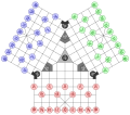 Three Friends board

![[2]](http://www.flaggenlexikon.de/viet-sp.gif)
- Article(s)
- Game of the Three Friends
- Request
- Board of the
Game of the Three Friends.
See this. --
Skirtland (
talk)
15:35, 31 July 2015 (UTC)
- @ Skirtland: How does this look? Cheers, Mliu92 ( talk) 20:37, 31 July 2015 (UTC)
- @ Mliu92: Thanks!!!!!!!!!!!!!!.-- Skirtland ( talk) 02:49, 1 August 2015 (UTC)
- Graphist opinion(s)
- Request
- This image needs to be amended so that "Wiki Project" does not display as "Wiki Projec" which it does on WP talk pages at present ("WikiProject" would be better, with no space).-- Johnsoniensis ( talk) 16:33, 4 August 2015 (UTC)
![]() Done Any good?
NikNaks
talk -
gallery
11:36, 5 August 2015 (UTC)
Done Any good?
NikNaks
talk -
gallery
11:36, 5 August 2015 (UTC)
- Yes it looks all right; thank you.-- Johnsoniensis ( talk) 18:57, 5 August 2015 (UTC)